How to Create an Educational Website or a Learning Management System
Published: May 2, 2022
21 min read
In this article, you'll learn:
1
🎁 Benefits of Creating an Educational Website
2
📐 Customized Website vs Website Builders: Which One to Choose?
3
🔝 Top Things to Keep in Mind While Creating an Educational or Course Selling Website
4
🌀 LMS vs. Website
5
✅ Top Features of an Educational Website
6
💰 How Much Does LMS Development Cost?
7
💡 Takeaways
Nowadays online education is at the peak of its relevance: many universities, schools, and businesses provide education online. In addition, the pandemic made people revolutionize the educational and e-Learning systems.
For instance, all Harvard University students (Bachelors 2024 and Masters 2022) will be getting their degrees online. Isn’t that crazy?
Besides, many skills (IT, design, SEO, SMM, etc.) can be received online and be a full-fledged start of someone’s career.
That means many people are actively taking online courses. Thus, if you want to increase reach and extend your audience, delivering your content online might be the right choice.
This graph represents the dynamics of online education and self-development relevance, as well as how the pandemic impacted them:
According to Forbes, the online learning market is projected to reach $325B in size by 2025 which is almost triple what it used to be a couple of years ago. It shows us that online education isn’t only relevant now but will also be in the nearest future.
In this article, we’ll go over the details of developing your educational website or course selling page. So if you want to know how a modern website can boost your e-Learning business — and what it takes to build one — hold the line :)
🎁 Benefits of Creating an Educational Website
Before we start talking about how to develop a website, let’s quickly recall why do so in the first place:
- You can reach a wider audience.
First of all, there’s no geolocation dependency anymore. Thus, you significantly increase your reach. Besides, you reach people who simply like e-Learning better than in-person.
Additionally, due to the COVID-19 consequences, many people prefer distance learning to in-person learning now since it’s much safer and helps to “flatten the curve”.
- You can reuse the content you create multiple times.
It’s quite beneficial that once recorded or created content is reusable and you can offer it to many clients.
Let’s say you have a business school. Without a website, only one class can take place at the same time for a limited number of people.

e-Learning website (image by Halo Web)
However, if you do have a website, you can record this class and offer it to as many people as there are on your website.
Still, don’t forget to update the information on your website from time to time.
- You can fully customize it to match your business needs.
Whether it’s a whole new business model or just a couple of activities you want to deliver online — websites work well in most cases.
You can also use your website to either create a new project that exists separately from the offline one (meaning, it has its clients, courses, content, teachers) and thus, expand your clientele.
Alternatively, you can use it to improve the experience of your existing and new students (for checking home tasks online, sending e-content, encouraging online cooperation via chats, forums, etc.).
- Improve reach and retention.
A potential website can give users multiple features such as customization, device compliance, personalization, etc., and improve your personal brand which can then positively influence your reach, retention and engagement.
📐 Customized Website vs Website Builders: Which One to Choose?
There are a lot of website builders (or website constructors) — tools that allow people to create an e-learning site without manual coding. However, many businesses and organizations still prefer to develop a customized website.
Let’s take a closer look at both solutions.
Top Cases to Use a Website Constructor 🔨
This option is just the catch for businesses and startups that don’t need a custom website at their current stage. This happens most often in the following cases:
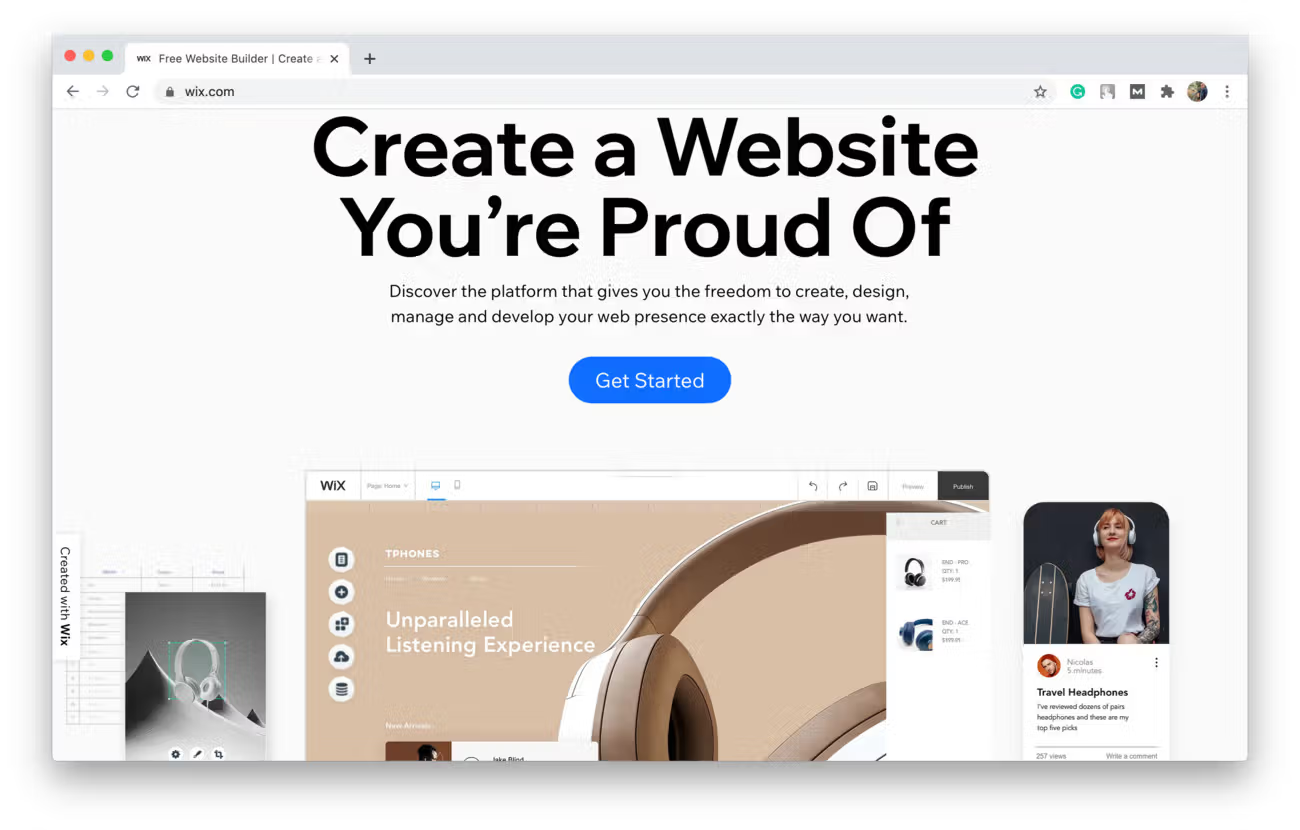
Wix website builder (shot from Wix)
# 1: One of the reasons to use a website builder is if you want to conduct a test-drive of your idea — check its viability, demand, and other important metrics.
For instance, if you have an offline business and are planning on offering your services online, isn’t it a great idea to develop an MVP?
MVP, a minimum viable product, is a version of a product that you build to provide enough features to satisfy basic customer needs and get feedback for future development.
With a website builder, you’ll be able to do that at a low cost. Moreover, you could see if your potential clients like your online services and are willing to pay for them.
# 2: You can also consider creating a landing page to promote your offline services (make a school website, for instance) in case you don’t want to go digital as of now but need a website to present your services.
For example, if you want to promote your business online, your ads should lead somewhere. A simple landing page is exactly for such purposes.
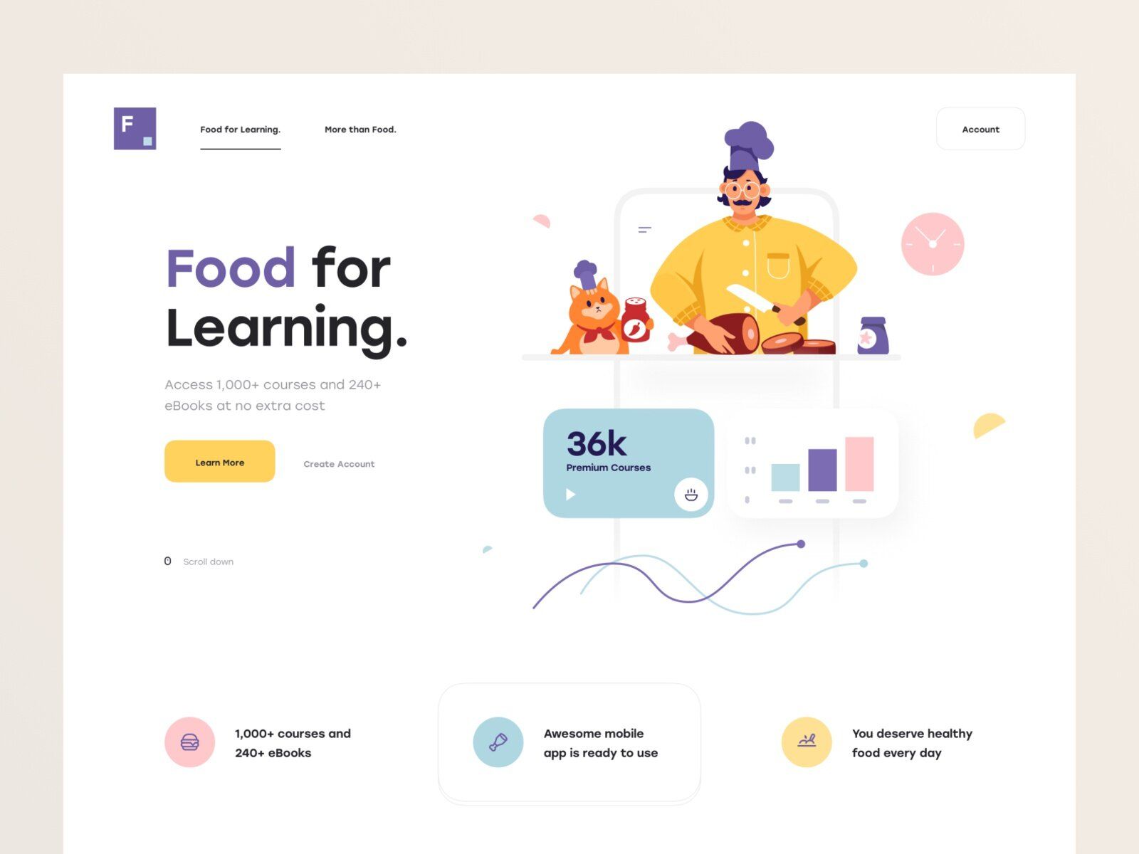
Landing page (by Tran Mau Tri Tam*)
Nevertheless, keep in mind that the functionality of landing pages is quite limited.
It’s usually enough to place some general description, info on teachers, some kind of testimonials, an introductory video, pricing options, but not much more. If you’re looking for some special features or a really unique design, custom educational website development might suit you much better.
# 3: Website builders can be used for landing page development if you already provide your services online, too. That’s the case when you already have an established system based on third-party tools and don’t want (or don’t have the resources) to integrate them all within a single platform.
Let’s say, you use Skype or Zoom for online lessons. While it’s not the best time to allocate budget for custom website development with an integrated video calling system, you may still develop a simple landing page to get new customers.
To better understand what perks and weak points it has, take a look at this illustration:
Benefits
- Cost-free with limited functionality or a small monthly subscription.
- Allows you to build your website quickly.
- No skills are needed.
- Great for a starting stage.
Drawbacks
- The number of templates is limited.
- Most of them don't allow you to create online courses in it.
- May not provide all needed features (video calling, file uploading, etc.).
- Can have the name or logo of the constructor somewhere on the website.
Customized website 🖥
The name of this solution speaks for itself — it’s a website built specifically for you and your business for whichever purpose (landing page, providing courses, delivering language classes, etc.).
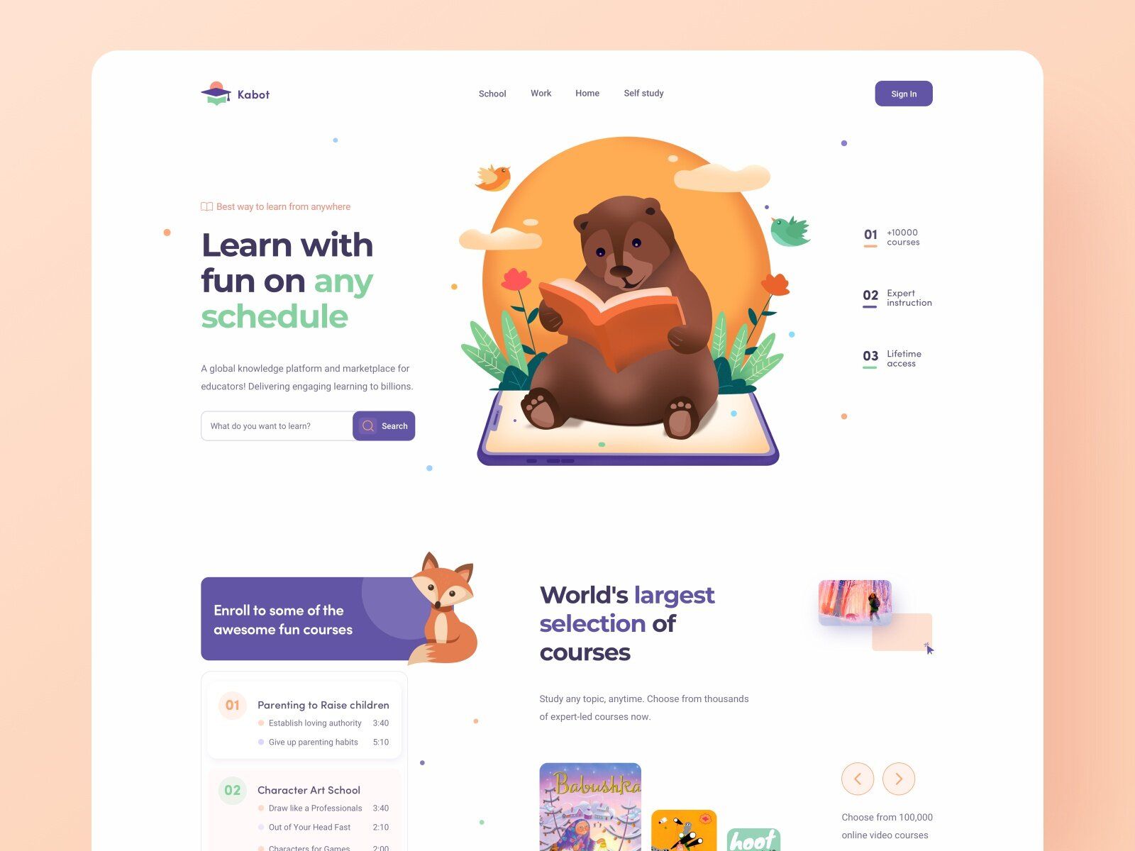
Customized website for selling courses (shots from Acarnet)
Most often people develop a customized website for these purposes:
# 1: If you’re planning on implementing an already proven idea. In this case, custom educational website development is often a good way to follow since it can help to scale your existing business model.
How can you tell that the idea is proven?:
- You are providing online services using third-party tools, and it’s successful.
- You’ve done an MVP, gathered feedback, and are ready to iterate by developing a custom website.
- The idea is proven by someone else. For instance, you know that someone's online English school Skyeng is a successful project and your own idea is quite similar.
That might mean that this type of business is highly demanded. However, someone else’s success doesn’t guarantee you’ll have it too.
# 2: This step is often the next one after creating an MVP.
Imagine: You have an MVP that came out more than successful or you have a website that was built using a constructor.
Now you want to scale your website and make it more functional to better meet the goal you pursue. Thus, to make it real, you might need to develop a customized website.
For example, once we were reached by an online copywriting school. They offer copywriting tutorials and provide tools as well as courses for freelancers and marketers.
Firstly, their website was created with the Thinkific builder. However, since they needed to expand their website’s functionality, they developed a customized one.
It’s a great example of how the need for a more extended set of features leads to building a customized website.
# 3: You want to add specific custom features to your website. It may be video/audio calling, file uploading, calendar, built-in tasks and quizzes, video lessons, etc.
Many constructors won’t allow you to integrate such features as they don’t support it. Moreover, even if they do, it’s likely going to cost you a pretty penny for a custom experience. So, it's not a good option either way.
When developing your own website, you can expect these advantages and disadvantages:
Benefits
- Create custom design that will perfectly match your brand style guide.
- Implement any features you need, including integration with other third-party services you already use.
- Beneficial in the long run since you can make *any changes* at *any time* whereas the builders’ functionality is limited.
Drawbacks
- Usually more expensive than using a website builder.
- It takes more time to deliver a custom website rather than build one using a constructor.
- Requires coding knowledge — hiring a Tech Partner that can build such a website for you is the way to go.
🔝 Top Things to Keep in Mind While Creating an Educational or Course Selling Website
In the online education industry, there’s strong competition. Coursera, EdX, Skillshare, Skyeng, Lingoda, and many others — all of them successfully run their businesses right now.
Thus, you have to take the preparation stage seriously and have your skates on once you enter the market.
Even if you already have an offline business, many details of running an online one may be new to you, so it’s worth spending quite some time educating yourself.
We’ve come up with a couple of steps that we recommend you follow to start your online business as flawlessly as possible.
Different purposes 🎯
First things first, you may want to build an online course or educational website for various reasons.
It’s of high importance to clearly set goals since they’ll define the number of features, the website’s structure complexity, and thus, the budget and time needed for its development.
So, it can be:
- A course selling website
You can build online courses dedicated to various topics from UI/UX Design to Chinese and offer them to users.
A good example of such a solution is Сodecademy who offer coding courses.
They have a free offer with only the basic courses as well as a paid subscription. These guys also provide courses for businesses and teams - a great example of how a course selling website can work.
Keep in mind, we’re not only talking about education from a classical point of view. You can create an online workshop for time-management, set up an online course where you give advice on how to control your anger, and so on.
- A marketplace website
This type of website is where you allow other business owners and seekers to provide content and use it respectively.
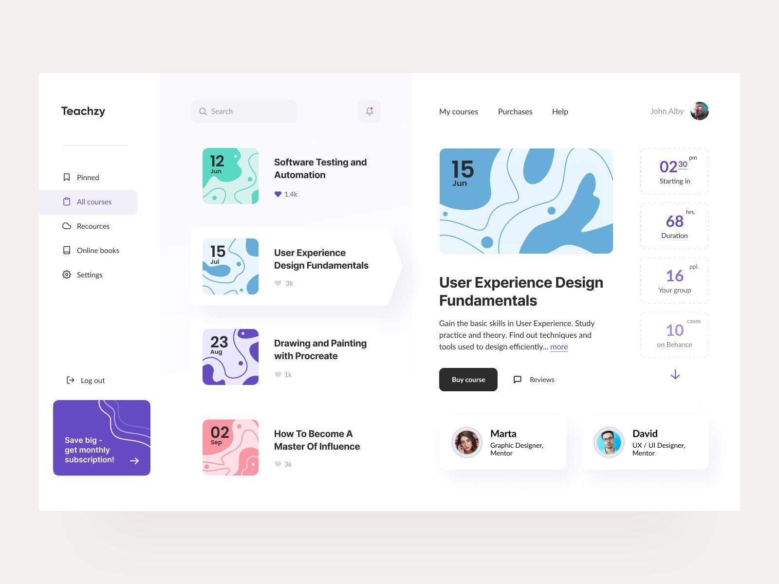
Marketplace website for selling courses (image by Daniella)
One of the most well-known players in the market is Udemy. They provide a place for course sellers and seekers to cooperate. The terms are quite common — one-time payment to get access, however, it’s life-long so people can study at any time or freshen their knowledge whenever they want.
- A website for institutions
If you’re an owner of any educational institution, you can create an online class with the help of a website to save time as well as partly or fully switch to a remote type of education.
- A complementary website for offline schools and courses
You can create an online school to integrate different IT-technologies into the learning process: allow your students to complete homework online or just do some additional activities.
Market Research 📈
As mentioned before, the competition in this industry is severe and there are currently a lot of players on the market.
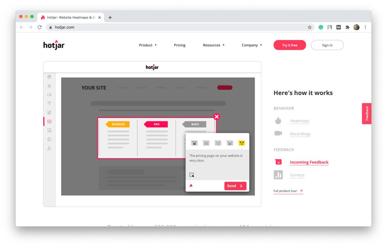
To make an online course don’t forget to be fully prepared (shot from Hotjar)
Thus, to create online courses that people will actually pay for, you have to stay ahead of the competition. One of the best ways to do so is researching the market.
Here are some tips on how to do market research:
# 1: You can look through the content they offer and compare it with the content you’re planning on providing. Consequently, you can adapt content to the market needs, find a free niche, and so on.
# 2: You can also read articles about your competitors to learn from their failures and successes, and then create an e-learning site with the knowledge of what practices work best.
By doing this, you can not only prevent the mistakes somebody else has already made but find out how to do better than anybody else.
# 3: Another great thing you can do is researching the statistics and most used search requests in your niche.
This way, you make sure that what you want to offer is demanded.
User-friendly design 😀
A user-friendly design is really important for every platform with any purpose — whether you want to create an online school or just a site to submit tasks. A website that’s difficult to use can be repulsive for visitors and lower your retention rates. A user-friendly design for a website means it's:
- Fast and regularly gets tested for malfunctions.
- Consistent with various browsers.
- Mobile-friendly.
- Organized ith well-structured content.
- With customization tools (theme color, avatar, dashboard, etc.).
- Intuitive in navigation.
If you take a look at some of the most successful websites in this industry, you’ll see that none of them have many bright colors, and the color of the background and the content is mostly contrasted.
Let’s take Coursera as an example:
Their website consists of two colors — a white background and blue buttons. The text is eye-catching and not too bright.
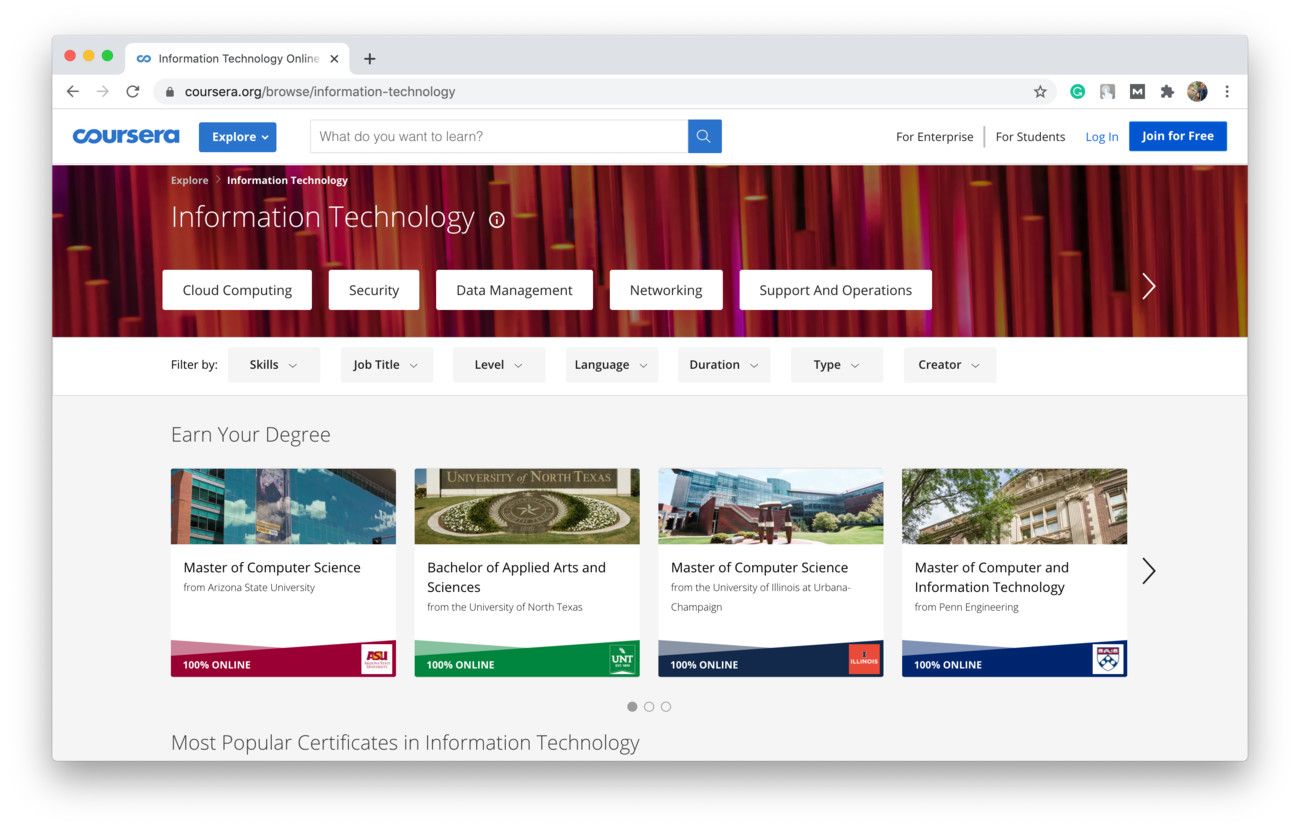
Coursera website design (shot from Coursera)
And most of them (Skyeng, Lingoda, Skillshare, etc.) are like this they have a white background and a contrast color for buttons and text.
Depending on the goal you pursue, you might want to use different colors. For instance, if you provide a finance course, it’s not reasonable to make the website bright red or yellow. You would probably choose something more formal.
But if it’s a yoga course, you might want to use green or light blue, or some other calm color.
Up-to-date information 📖
Nowadays, information can become outdated in a matter of weeks. Technologies get updated, new information comes in every single day; all of these factors make regular info updates one of the most important things when creating a course for your website.
Thus, it’s essential to make your content as new, relevant and accurate as possible.
If you use outdated information on your website, the client can:
- Hesitate about your commitment.
- Think you no longer do business.
- Choose another service.
Besides, it’s not good for your position on the market.
By not using and implementing new data, you may fall behind and ultimately get out of business in the long run.
🌀 LMS vs. Website
While creating an educational website, you’ll most likely come across the term LMS. So, we decided to walk you through the basic information about it.
Let’s do it this way: we would try to predict your questions and make a little FAQ right here, in this article.
So, what is a learning management system (LMS)?
It’s a software application for documentation, tracking, administration, and delivery of educational courses, training programs for companies, or just development courses.
What functionality does it have?
You can develop a learning management system to create courses, automate data collection and analysis, conduct employee certifications, run tests, monitor each user’s activity, and so much more.
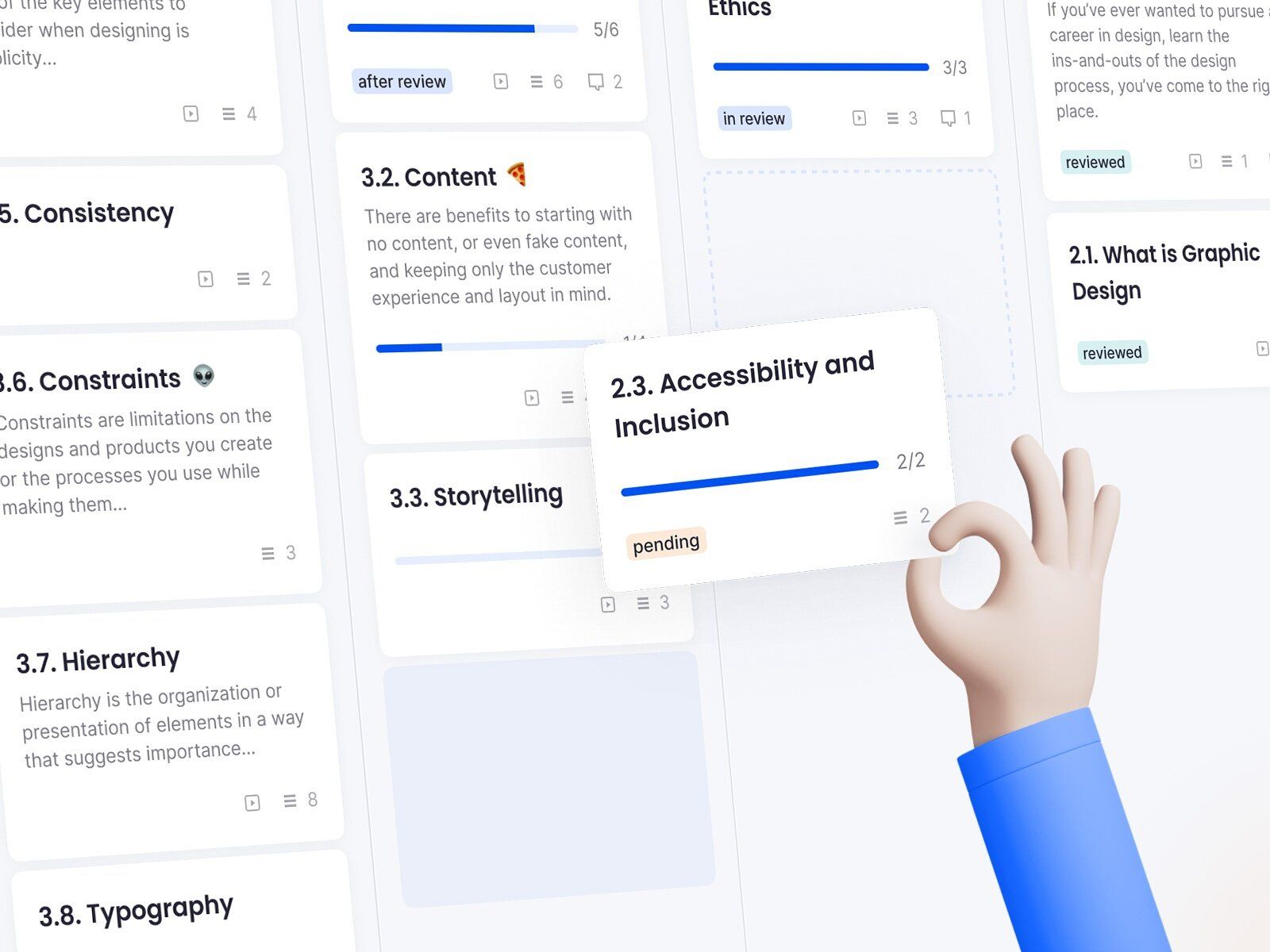
LMS (image by Arkady Nuriev)
How is it different from an e-Learning website?
Basically, all LMSs are e-Learning platforms but not all e-Learning platforms are LMSs. To be honest, the difference is on a quite complex level. To understand it let’s take a look at LMS special features:
- An LMS can be used for a wider range of purposes (create an online training course for a company, or run a certification) and is often the base of educational websites.
- While a website is intended to provide information, for the most part, an LMS’s main purpose is to manage it (gather, organize, share, analyze, etc.).
- An LMS can offer a built-in course creation tool.
Who needs an LMS?
To get some visualized information on what to create an LMS for and who uses it, we recommend watching this short video:
✅ Top Features of an Educational Website
In this section, we’ll review the main features an educational or course selling website should have.
# 1: Sign Up & Profiles 🔐
This feature is very important since it’s the first impression potential customers get when first using your services.
So, how do you make a compelling impression?
First of all, make signing up as fast and convenient as possible. It’s essential because if customers have to spend a lot of time typing in their personal information just to enter the catalog of services, their engagement is most likely to drop before they even get a glance of what is available.
Consider having users sign up after you show them your services and all terms & pricing. This can help you build a trusting and transparent relationship with them.
To make signing up just a quick and not stressful step, ask users the following:
- Phone number, email, or login (one of three).
- Password.
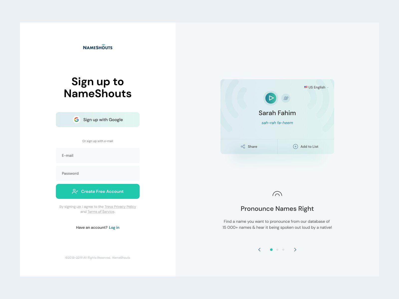
Fast Sign Up on a website (image by Dominik Bednarz)
One of the best things you can do for both yourself as a business owner and your users is implementing Social Sign Up.
On the one hand, you can use information from their Social Media to increase sales and improve your marketing campaigns by making personalized offers.
It’s great for targeting and personalization them since you can get their name, age, location, friends list, etc.
On the other hand, this feature will significantly speed up the sign-up process, thus, lowering the bounce rate.
# 2: Dashboard 💻
This feature is usually referred to as what users see after signing in. It has 3 main purposes:
For users:
- Helps to keep track of their progress & manage course-related tasks — courses they’ve completed, current courses and lessons, due dates, test results, etc.
- Gathers all of the key features in one place — continue an interrupted lesson, take a quiz, course catalog, etc.
For business owners:
- Increases sales — you can promote the most popular courses, special offers, holiday discounts, offers based on users’ interests — just whatever meets your business needs.
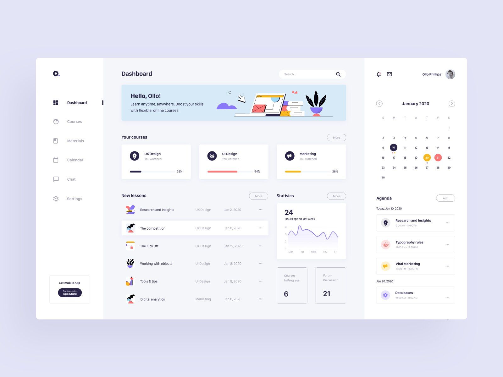
Online learning website Dashboard (image by Ania Cywińska)
However, remember not to make it bulky — try to be minimalistic and add an adequate number of details so it’s not too much.
Additionally, consider making the Home Screen changeable — theme color, features accessible from the Dashboard, information (current courses, finished courses) on the Dashboard, etc.
We all know that “one-size-fits-all” doesn’t really work. In online education and courses, it’s all about customization since quite a big part of a business’ success depends on it.
# 3: Filtering & Sorting 🔍
If you provide lots of content, it’ll be quite difficult to navigate through the catalog without a Filtering & Sorting systems. Especially, if you want your website to be a marketplace for course providers or tutors, or just those dedicated to different spheres, this feature should be on your must-have list.
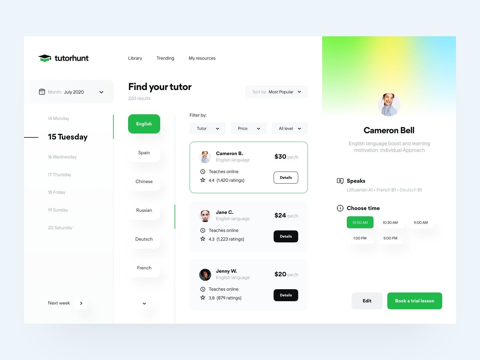
Tutor website filtering (image by Vadim Drut)
You can organize search & filters in this way:
- Search bar.
- Categories (Design, IT, Economics, Languages, etc.)
- Filter & Sort (by duration, price, level).
Bear in mind, depending on what services you provide, the filtering feature may vary.
For instance, if you offer language courses, a search bar and a filter for the different languages & their level should be enough.
# 4: Course Screens 📊
To make your website fully convenient for potential clients, you can add a set of screens for titles, courses, and lessons.
Titles Screen
If you offer a certain number of different courses, you can add Titles Screen. It’s made for users to better understand the initial idea of what the course or category is about.
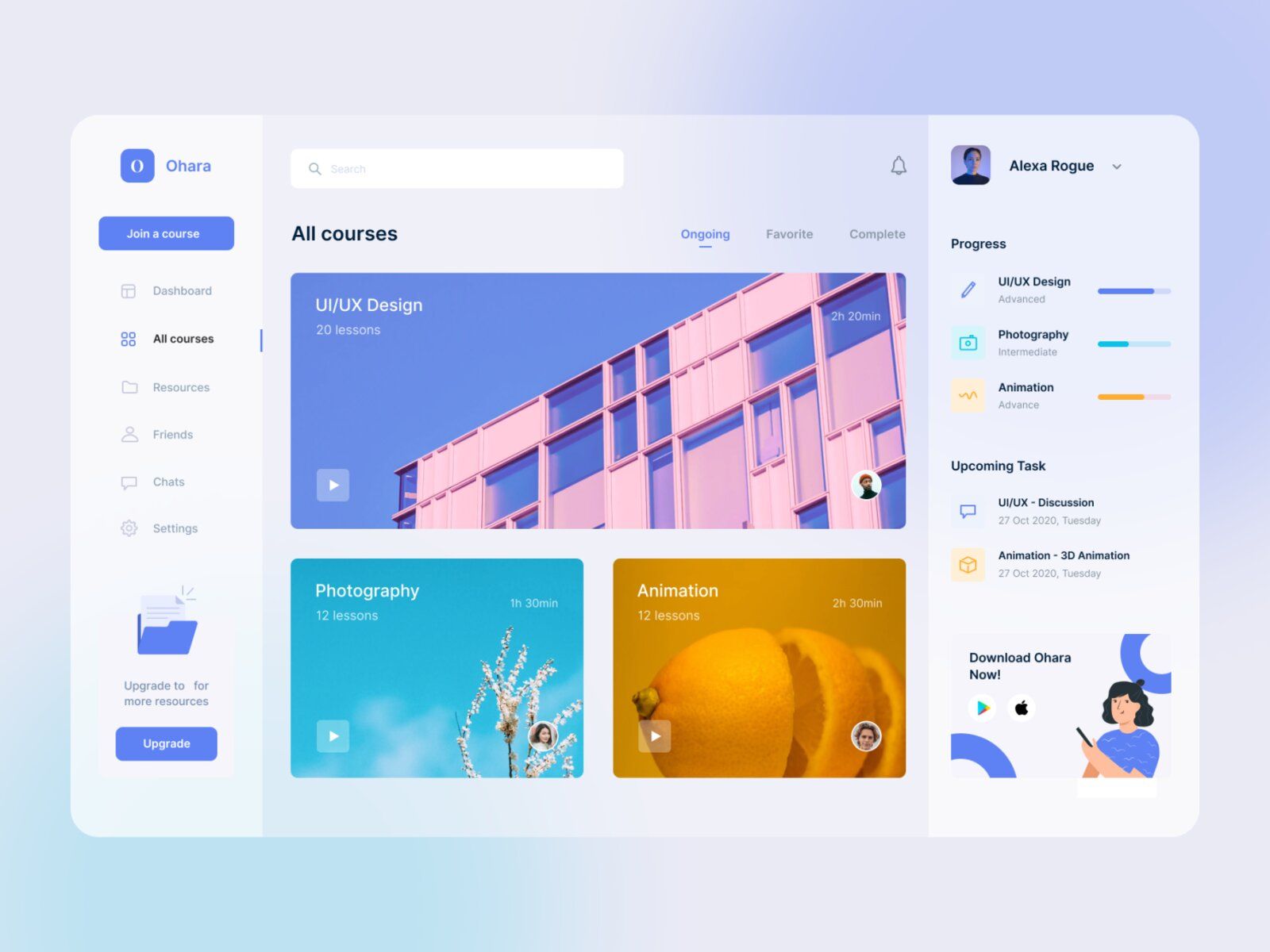
Course list with titles (image by Douglas Ramos)
Along with the title, you can add the price, duration, level, etc., but of course it’s up to you.
Course Screen
This is where price, level, and the average duration aren't optional but rather must-have.
The main idea of this screen is to give users a full picture of what the course is about, and what skills you can acquire.
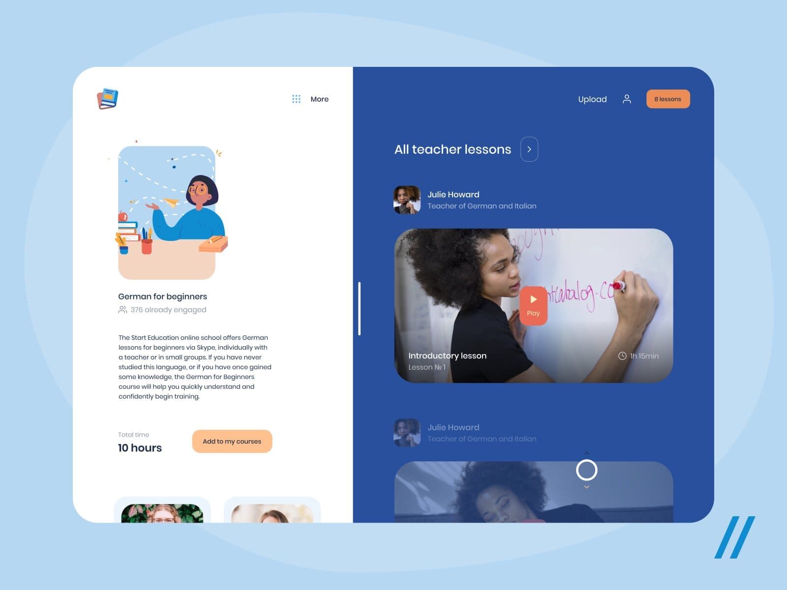
Course Screen (image by Purrweb UI)
Here’s an overall list of the information you can add to this Screen:
- Course description.
- Level, price, duration.
- Learning materials.
- Name of professor, teacher, or coach.
- List of topics.
And don’t forget to add the “Purchase” button if you take payments for each course separately.
Lesson Screen
It’s kind of a tricky one since too much is never great for your retention rate, thus, we don’t recommend adding too many different screens.
Still, if you offer a lot of materials within one lesson (e.g., video, quiz, task for after the lesson, feedback, etc.), think about adding a Lesson Screen.
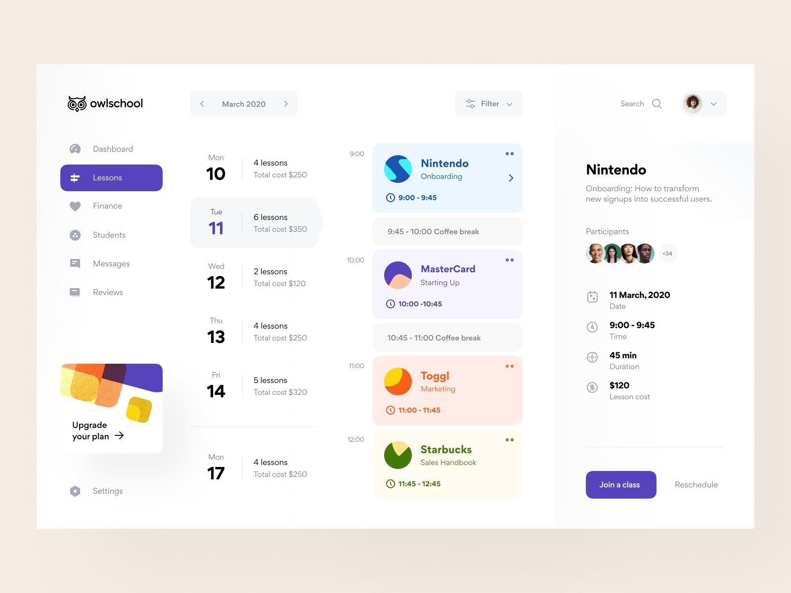
To create an online class consider adding a lesson Screen with a description (image by Vladimir Gruev)
It’s also a great idea to add a “Next lesson” button which can save users time.
# 5: Teacher Profile 🙌
It’s quite easy to underestimate the importance of making a great teacher or coach profile.
But in reality, knowing their background is what can boost customers' motivation, and give a full picture of what the person can give and teach them.
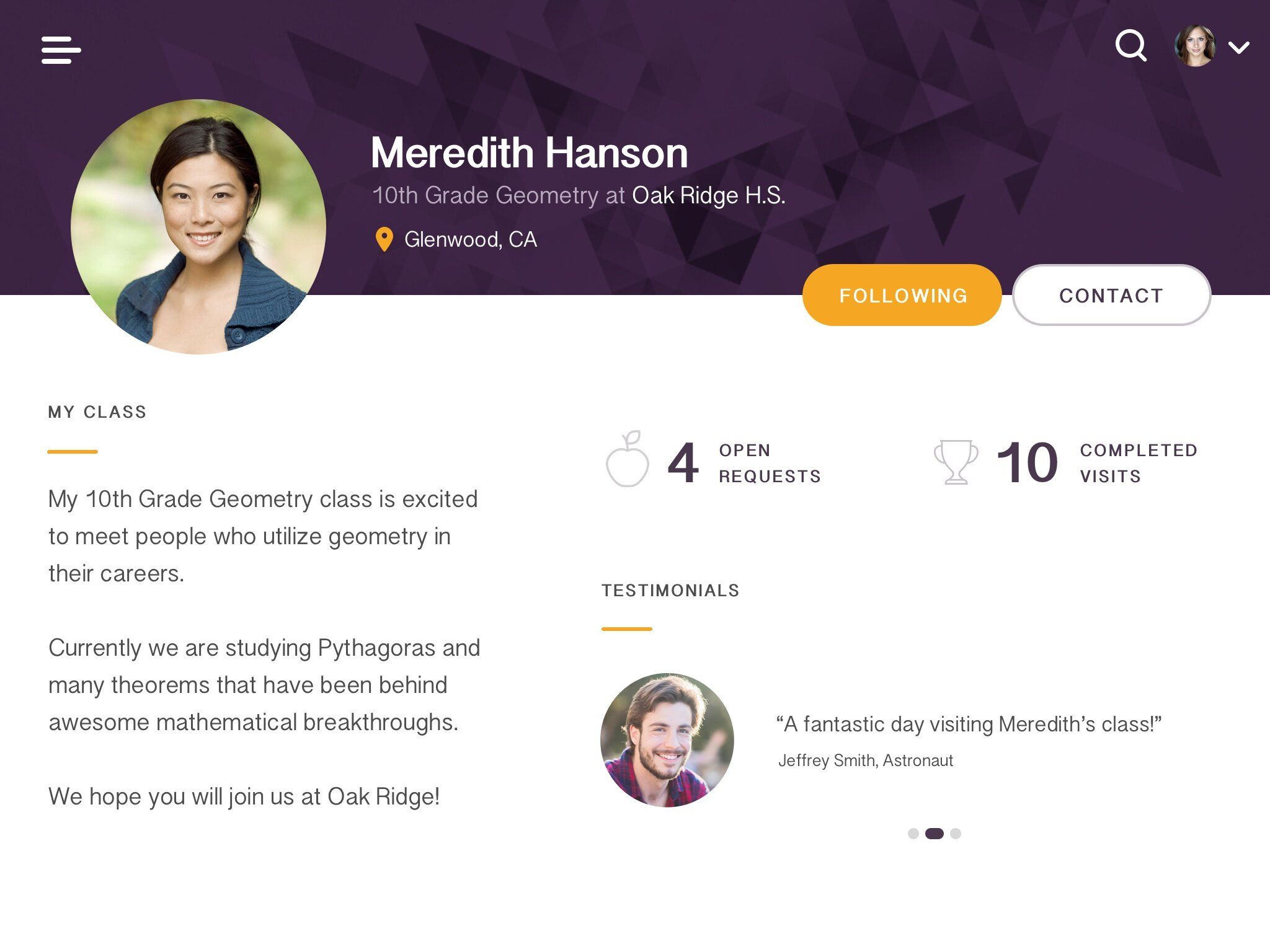
If you want to create an online training course that people will buy, the mentor’s profile should motivate (image by Andika Wiraputra)
Many courses from top universities and coaches include a whole lesson dedicated to getting to know the mentor (teacher, coach) and the materials.
Again, knowing who you’re getting knowledge from is as important as the information itself.
# 6: Special Learning Features 🎓
While developing your website, you’ll probably change your mind about what features you think you need for it. And we can’t predict your set of features.
However, we can make a list of some special ones that you as an educational website owner might want to add to it.
Video player
This one is pretty obvious yet worth attention.
Since most online education services use videos as one of the most used forms of content delivery, a video player is what’s often demanded.
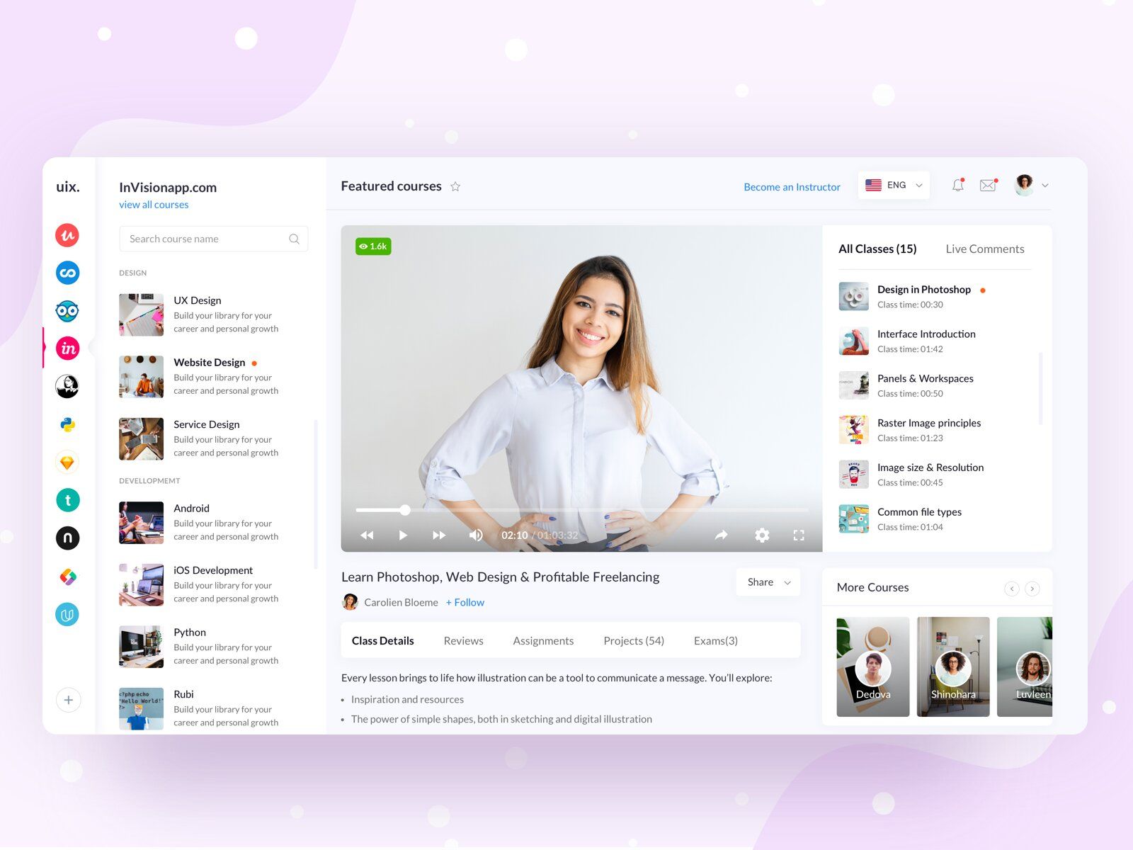
Video lesson in the course (image by Piko Rizky Dwinanto)
Consider making this feature as useful and convenient as possible. That is, try to make it functional.
You could add:
- 10 seconds rewind and forward.
- Play from the moment you stopped the previous time.
- Various playback speeds (1.25x; 1.5x; 1.75x; 2x).
- Automatically translated subtitles.
One-on-one and Group calls
If you’d like to create an online workshop, mentor sessions, or live streams, this feature will be an inherent part of the development.
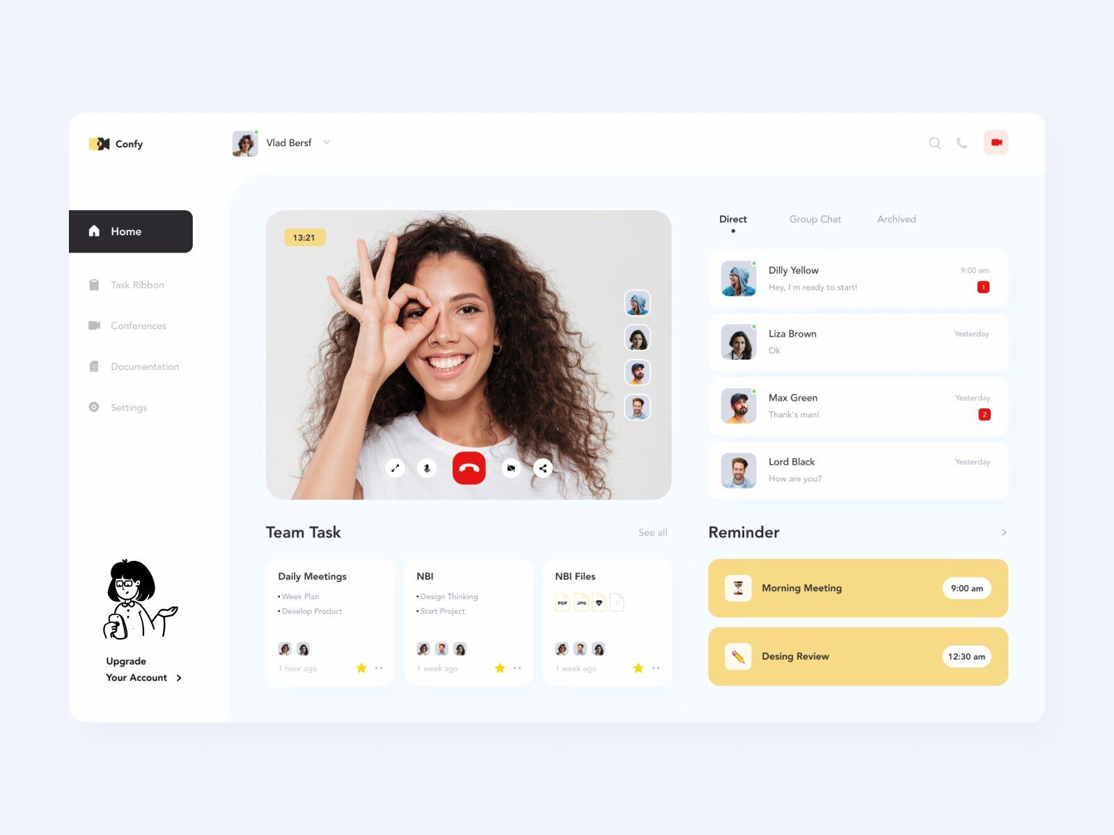
Video call on a website (image by Afterglow)
You can add some special details here as well. These can be “Share Screen”, live chats, mute/unmute microphone, emojis as live emotions, etc.
To stand out and make this feature funny, some websites allow users to change their background, use masks, and so on.
Quizzes and tests
It’s well-known that the best way to memorize a piece of information is to reproduce it from memory. This feature is just the right one for this purpose.
Many scientists puzzle over different ways to implement it in offline education and yet our system still isn’t made for it.
However, in the online industry it’s no more than a hiccup to add a testing effect — just ask your students a couple of questions after each lesson, ask them for feedback on what they’ve learned, etc.
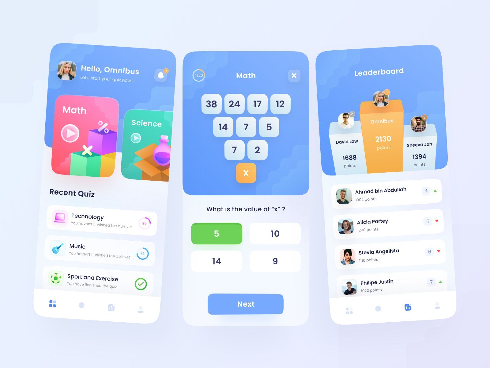
Quiz (image by Rizal Gradianto)
There are many forms of tests:
- True or false.
- Add a missing word.
- Multiple choice.
- Put in the correct order
- Problem-solving, and others.
File uploading
This feature is also quite popular since studying and learning often includes file sharing from both sides (learner/student and tutor/teacher).
You might need this feature to:
- upload files during a live lesson.
- send files to a specific user.
- let users upload files to share with a tutor/teacher.
# 7: Gamification 🎮
To increase engagement and retention rates many website owners add gamification features.
Users benefit from it as well — they help them concentrate and feel like they’re treated personally.
These are:
- Platform currencies. Normally, they’re given for different activities and allow users to exchange them for bonuses, discounts, or merch.
- Achievements & Goals (daily, weekly, monthly).
- Points systems & Leaderboards.
- Customized avatars.
- Progress bars.

Achievements, progress, points (image by Ivan Jankov)
You can not only use this feature to entertain users but to increase sales as well. For instance, you can add “Invite a friend” or “Share your progress on Facebook” achievements to improve reach.
# 8: Calendar 📅
We’d recommend adding a calendar to your website since it’s quite a useful thing which is often underestimated.
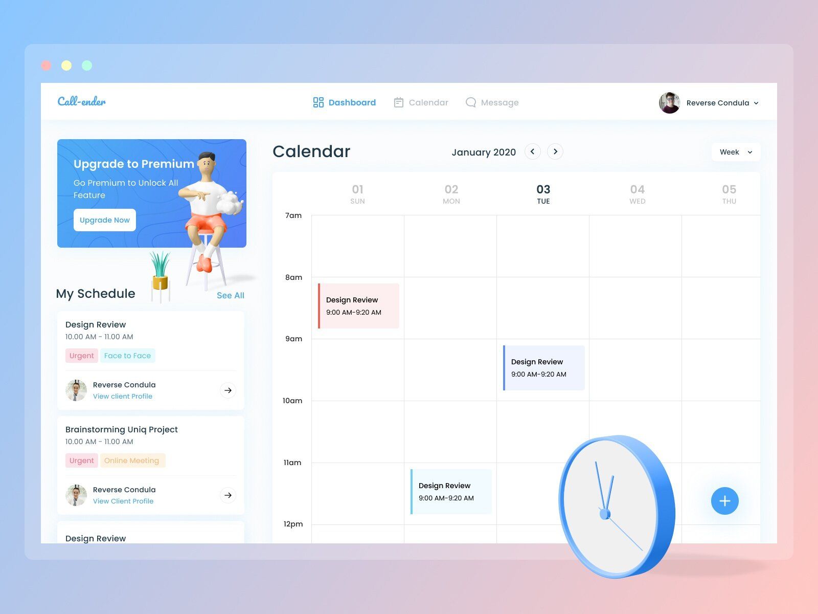
Calendar (image by Dicky Indrayan)
You can use it to:
- Remind users about upcoming events and scheduled classes.
- Make personalized offers that are limited in time (for a particular date).
- Increase the retention rate (users would open the website more often since the calendar would be built-in, meaning they wouldn’t have to use other services for this purpose).
# 9: Customer Support ⚡
Great customer support is what makes the use of any website pleasant and makes users want to go back again.
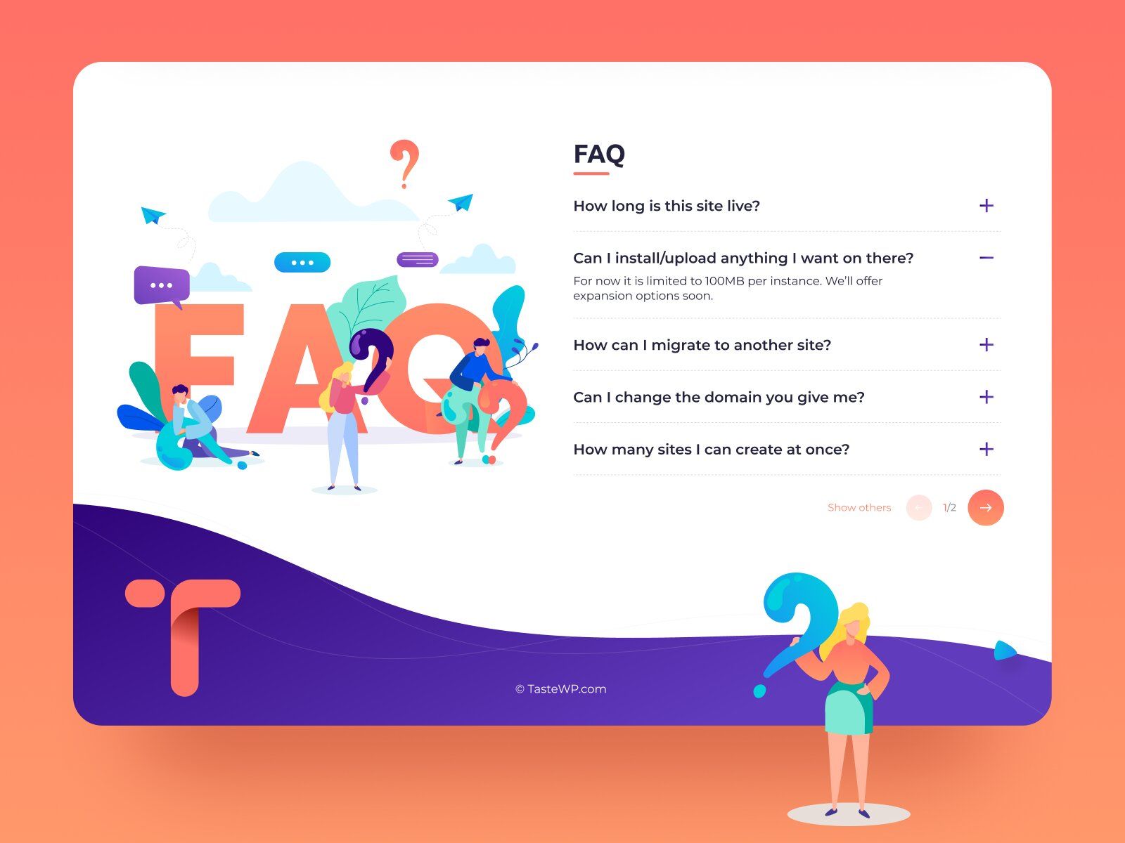
Customer support in form of FAQ (image by Aleksandar Savic)
By great we mean:
- Provide a chatbot and live chats.
- Be quick.
- Have a wide range of FAQs.
- Offer 24/7 phone support for an emergency.
- Have quick access to the list of contacts.
# 10: Payment Gateway 💸
If your platform is a course selling website or has extra paid services, etc., you would need a Payment Gateway.
To make it your strong point you should bear in mind that Payment Gateway should:
- Be compatible with all devices.
- Include such payment options as credit card payments, Google & Apple Pay, PayPal, etc.
- Be fast and without delays.
- Be compliant with regulations for data protection.
Speaking of payments, you can take them in multiple ways. It can be a one-time or monthly subscription, you can offer paid courses, or some additional services for extra payment while the basic set of functions (first N number of classes, a class without any certificates or feedback, etc.) is free, and so on.
Extra LMS Features:
# 1: Course Creation 📝
If you want to create an LMS, you should know that some of them not only allow you to upload courses from other platforms and services but to create an online course there as well.
For instance, Canvas LMS is one of those — it offers a course creation feature
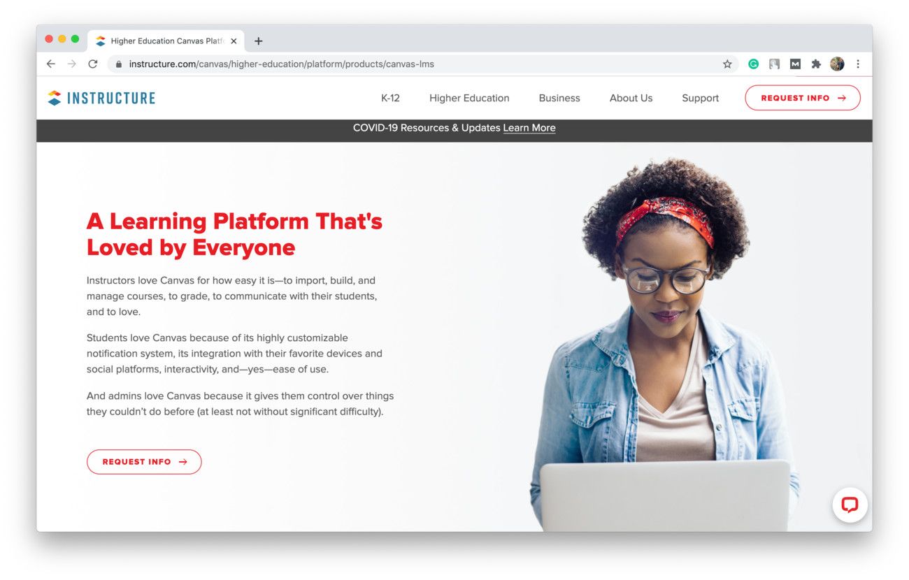
Canvas LMS allows you to build online courses (shot from Canvas)
A basic set of features any Course Creation should have is:
- Name & Description.
- Curriculum.
- Class.
- Topic.
- Participants & Owner.
- File uploading.
- Resources & Learning Materials.
# 2: Participants Profile
This feature is intended to help teachers/tutors control their students’ progress and results.
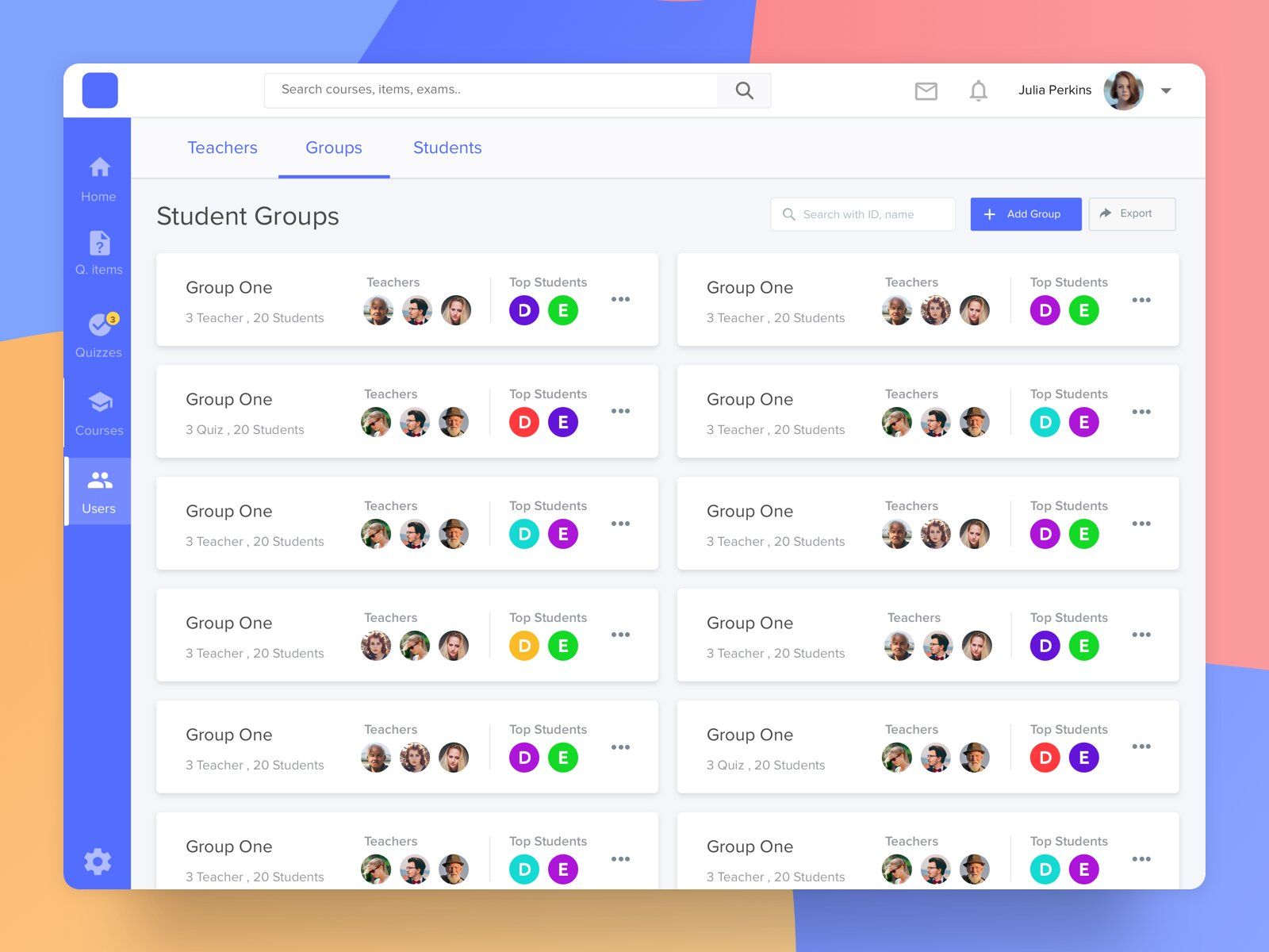
Participants list with assignments (image by Mohamed Kamal)
Profile for each group can consist of:
- The list of participants.
- Attendance.
- Assignments (submitted/incomplete).
- Grades.
- Chat for a group and private comments.
It’s also reasonable to create a separate profile for each student which would basically have the same information but it would be a lot easier to see work with since there would be no information overload.
💰 How Much Does LMS Development Cost?
To provide you with a rough estimation of what an educational website development might cost, we've created with table with various flows that you might need to implement. The cost per hour for the development is based on the Eastern European price range.
Educational Website/LMS Features Estimated in Hours
Using React Native
⚙️ Feature | ⏳ Min Hours | ⏱ Max Hours |
|---|---|---|
🔐 Sign Up Flow | 80 | 96 |
👤 Profile Management Flow | 44 | 64 |
💻 Dashboard | 68 | 82 |
🔍 Filtering/Sorting | 68 | 76 |
📑 Titles Screen | 86 | 96 |
📱 Course Screen | 76 | 88 |
📚 Lesson Screen | 68 | 82 |
👩🏫 Teacher Profile | 68 | 86 |
🔊 Video/Audio Player | 88 | 102 |
🤔 Tests & Quizes | 62 | 72 |
📥 Upload Files | 22 | 32 |
🎮 Gamification | 24 | 36 |
📅 Calendar | 24 | 36 |
🎧 Customer Support | 24 | 36 |
💳 Payment Gateway | 24 | 36 |
🛠 Course Creation (for LMS) | 24 | 36 |
⏱ Total Hours | 942 | 1184 |
💵 Approximate costs | $49,000 | $57,500 |
So, the price for the Educational Website or LMS development ranges from $49,000 to $57,500.
💡 Takeaways
Seems like now you’re all set and know what you should expect from the development of a website for education.
To sum up, we’d like to summarize the highlights of this article:
- Depending on the goal you are pursuing, you may want to create an e-learning website in a constructor or develop a customized one.
- You should fully prepare before starting the development.
- Check if you’d like to use or develop a learning management system instead of a regular website.
- Decide on the features you want on your platform.
- Find a TechPartner and start your journey.
If you have any more questions left, feel free to reach out to us. We’ll find a way to help you!
Our clients say
![Stormotion client Pietro Saccomani, Founder from [object Object]](/static/40e913b6c17071a400d1a1c693a17319/b0e74/pietro.png)
They make the whole business work for us, and their improvements are fundamental to our operations. They’re reliable, honest, and willing to try new things that will help us. We appreciate how flexible and easygoing they are.
Pietro Saccomani, Founder
MobiLoud
Was it helpful?
Read also


