The amazing story of how we managed to deliver an app prototype using React Native with just a single developer in 3 weeks.
Here at Stormotion, we like ideas that inspire us. And nothing can make us happier than inspiring ideas combined with mobile technologies 🙂
In our previous articles (for example, in the one about doctor app development) we emphasized the life-changing potential of apps. Nowadays it’s not just about entertainment. And Civocracy is the perfect example!

“Inclusiveness. Transparency. Privacy” © Civocracy
The general idea behind this startup was to let people change and improve their communities by the power of their voices. The whole project was born as a website where residents of different cities across Europe can gather to solve their local problems. Moreover, it allows cities’ authorities to collect feedback on their project and find out whether they keep pace with citizens.
The decision-making process is simple as that: initiate a discussion regarding the topic of your interest ➡️ involve people from your neighborhood or city ➡️ share your thoughts, ideas & projects ➡️ find a consensus and embody it!
In this way, for example, local communities managed to transform the center of the Dutch town Losser or improve the biodiversity policy in the Noord-Holland province.
But where is our team in this story?
📋 What Was the Task?
When the Berlin startup firstly contacted us, the guys already had a fully-operational website. However, like many other web-based projects, the Civocracy team realized the importance of being present in the mobile world. One of the main goals was to turn an active participation of citizens in solving civil-problems into their habit. And it would be quite impossible without an app, right?
Also, having a mobile app was a part of arrangements between the Civocracy team and Métropole Nice Côte d’Azur in France. Therefore, we carried a double responsibility: to our customer and to their French partners.
Thus, our task was to build a prototype of the app that can be used later for further development.
So, after the first conversation with our client we’ve already grasped the concept and correctly defined the main aims of the project as well as the main challenges for us. These were:
Aims of the Civocracy Team | Challenges for Stormotion 💪 |
|---|---|
Encourage citizens to use Civocracy on a weekly basis & increase the involvement into voting. | Implement push notifications that will retarget users once a week. |
Create a catchy concept of the app that will appeal to users. | Develop a mobile-friendly design as well as the perfect UI and UX. |
Complete arrangements with Nice on time. | Deliver a fully-operational app-prototype in less than a month. |
After thinking over the general concepts, we’ve moved to the more applied part of the development.
✅ Our Solution
Frankly speaking, it wasn’t the most difficult project we’ve worked on. First of all, it was a short-term project that didn’t require many developers or complicated planning. Secondly, our tasks were pretty clear (thanks to the Civocracy team for the very clear requirements and communication). And thirdly, our Berlin partners have done a great homework: they contacted us already understanding the concept and the workflow of the app.
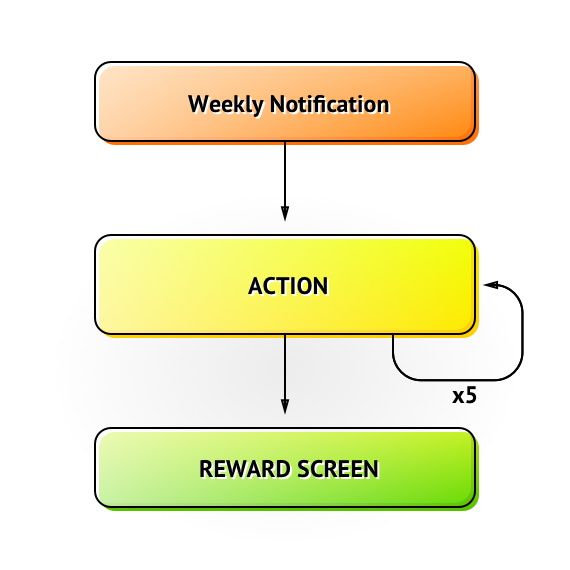
The workflow of the Civocracy app
We took it as a basis and together with our UI/UX designer offered the following interface of app’s structure that was in full compliance with the objectives of the application and its workflow:
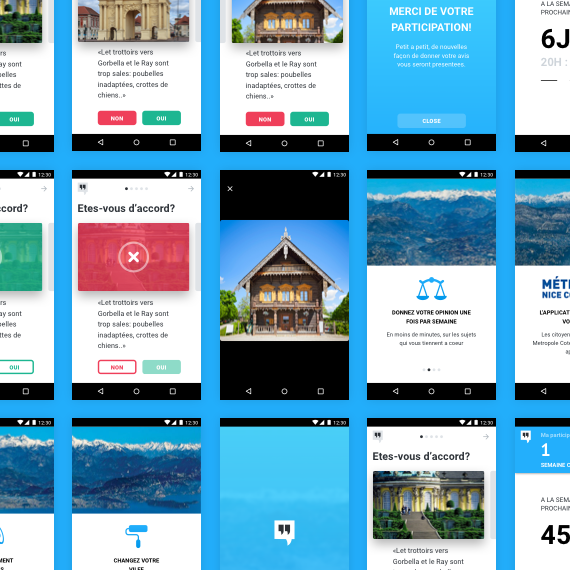
Interface of the Civocracy app
Our team had to be sure that the Civocracy app delivers a seamless UX on every screen. Moreover, the application should be intuitive and easy-to-use even for the newcomers.
For us at Stormotion, it was also important to keep the balance and design the nice-looking but minimalistic interface that won’t distract users from making community-changing decisions. So that’s what we’ve come up with!
Onboarding Screens
A set of 4 screens that appear when users open the Civocracy app for the first time. It doesn’t require any interactions since its aim is to familiarize newcomers with main rules & the workflow of the app.
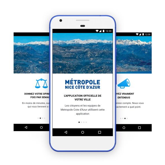
Onboarding Screens
Action Screen
We considered this screen as the most important. And, actually, it is since all the interactions between the app and the user take place there.
Adhering to the minimalistic approach, we didn’t overfill the action screen with excessive elements. Basically, it consists of 4 components:
- Text Field: the area where a question appears (users are also able to scroll it down).
- Cover: to illustrate the question with a relevant photo which is sent by the BackEnd.
- Actions: nice-looking yes/no buttons and the possibility to pass the question. Choosing the answer is complemented by a beautiful animation.
- Progress Bar: indicates the number of already voted questions and shows how many are left.
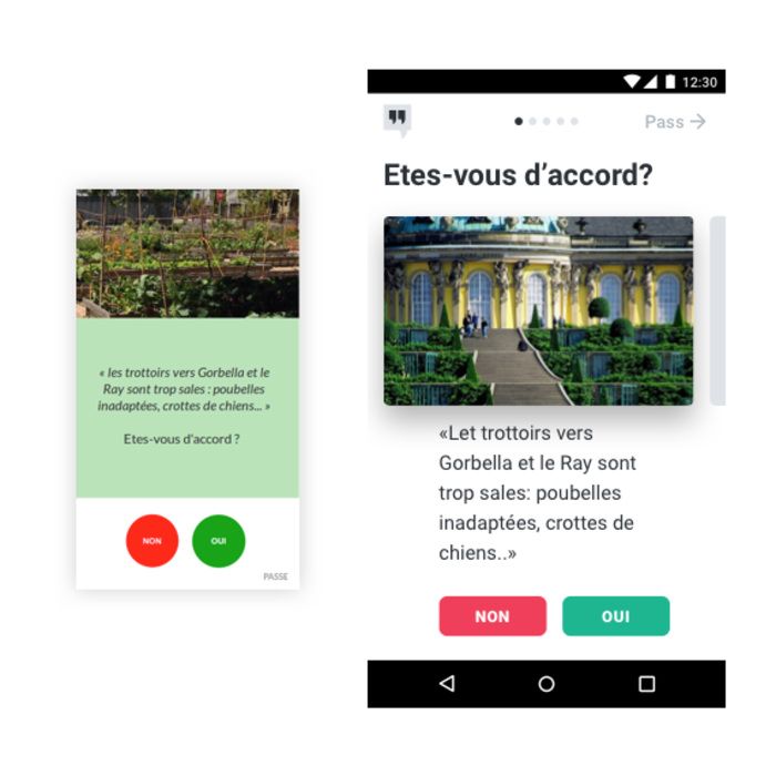
Action Screen
Reward Screen
This is the last screen users see right after voting and before leaving the app. However, don’t take it skin-deep as through the reward screen we managed to fulfill several important tasks.
The Element | The Aim Behind It |
|---|---|
Text Field: a personalized thankful message sent to the user | The message points out the end of voting & the personalization component creates a stronger emotional bond with users |
Weekly Participation: sent by BackEnd. The number of weeks in a row, during which the user has participated in votings | This element forms a habit of voting & increases engagement since users will try not to miss a single week (otherwise the counter is reset) |
Countdown: shows the time left before the next voting session | Since votings occur once a week, it’s a convenient tool for users who want use the app on time |
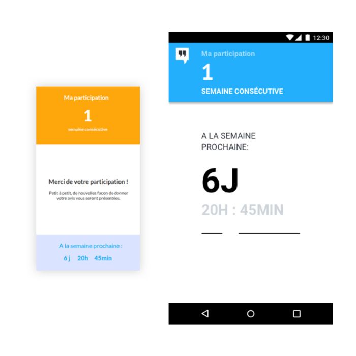
Reward screen in the Civocracy app
We have already mentioned several times that the strict and close deadline was one of the challenges of this project. Yet, how much time did it take to deliver the Civocracy app-prototype? Take a look at the detailed timeline below!
🕰️ Timeline
Let’s run a small test. We’ve already described you the workflow and UI of the Civocracy app prototype developed by Stormotion. Try to guess, how many days our developer Alex spent to build it from scratch for iOS and Android, and put your number below:
Are you ready for the right answer? Here it is:

So, it took us 19 days to build Civocracy for both Android & iOS platforms. What tech tools helped us during this process? That’s the next point of our case study!
⚙️ Tech Side of Development
Framework & SDKs
First and foremost, you are probably wondering how Alex managed to create the app for both platforms at once. A bit of development magic and… the use of the React Native framework. It allows writing JavaScript code that can be reused for both platforms and is working inside as native code (which gives the best UX, compared to other technologies). Finally, you just have to solve some platform-specific challenges so that your app works and looks like a native one on iOS and Android at the same time.
We also used Expo for the development optimization. This SDK allows to instantly update the app by passing long compiling and review processes. So Civocracy users may be sure that they’ll get all the updates on time!
Architecture
The app is based on Redux architecture. It allows normalizing data management by introducing same lifecycle patterns for all flows of data. Thus, it makes the logic of the Civocracy app more predictable and easier to understand.
Libraries
Alex also used the following libraries during development:
- Lodash - a utility library that helps to work with objects, arrays, strings, numbers etc.
- Moment.js - to configure the countdown system.
- react-native-image-zoom-viewer - to allow the user interaction with the cover image.
- react-native-transition - to deliver smooth animations in the app.
💡 Summary
Finally, we managed to deliver a pixel-perfect prototype in just 19 days. Despite the project was pretty simple, with its help we managed to become even more experienced in:
- cross-platform React Native development services that allow to deliver an app for iOS & Android platforms almost simultaneously;
- working with hard deadlines.
Our Berlin partners were also satisfied with the final result. We wish Civocracy to succeed in involving citizens in the life of their community and looking forward to further cooperation!
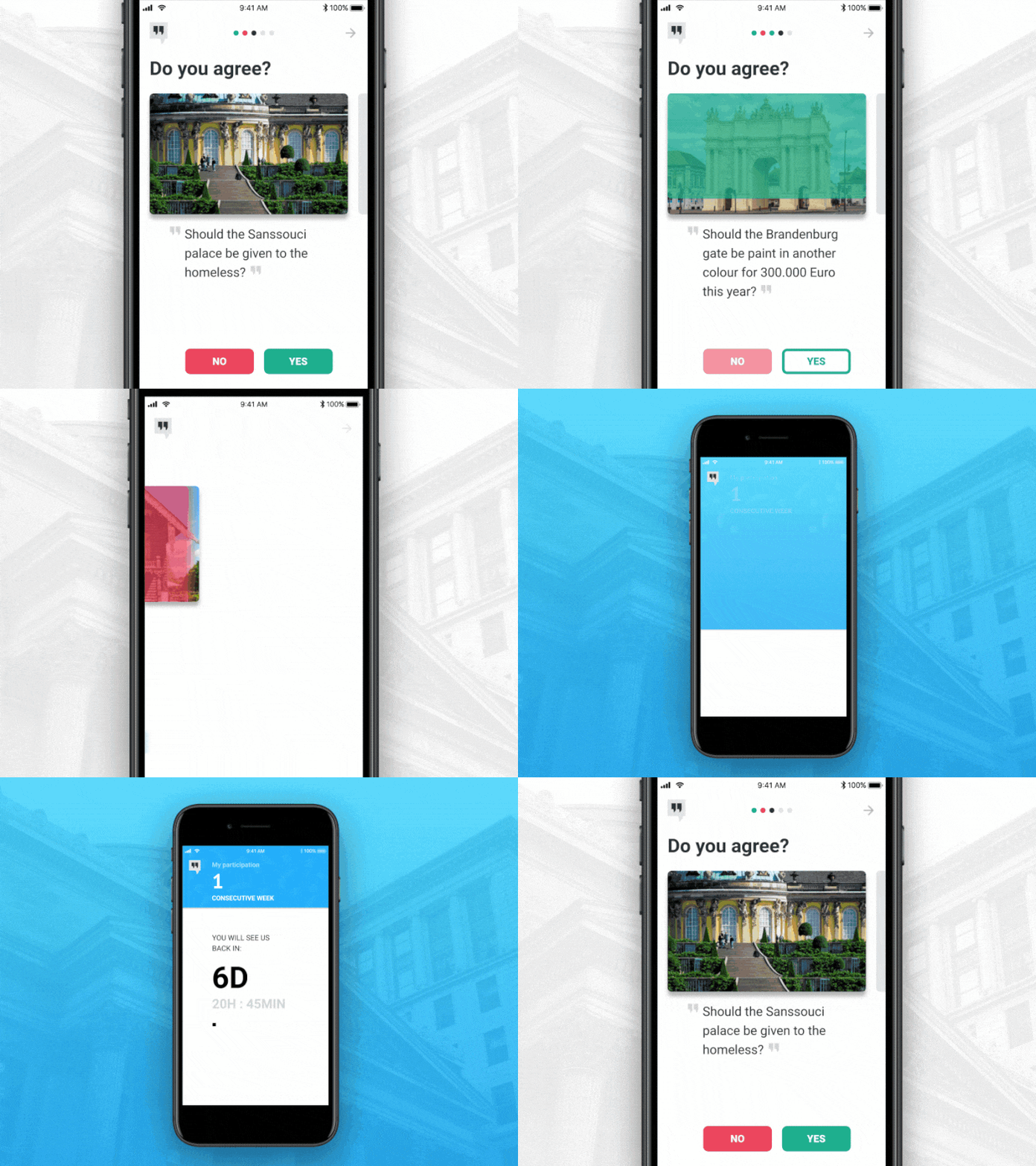
Action screens in the Civocracy app

![Stormotion client Pietro Saccomani, Founder from [object Object]](/static/40e913b6c17071a400d1a1c693a17319/b0e74/pietro.png)


