Cooking is an absolutely special process. Some see it as a highly artistic event, while for others it’s just a part of their daily routine. However, no matter on which side you are — cooking app development is something that can help lots of people.
Why?
Easy! People from almost any social group can be your Target Audience. Men and women, adolescents and adults, families and those who live alone — they all cook in one way or another and having a special recipe app on their smartphones can definitely help them.
It’s also possible and even reasonable to concentrate on a specific niche for your Target Audience. For example, build a cooking app especially for vegetarians.
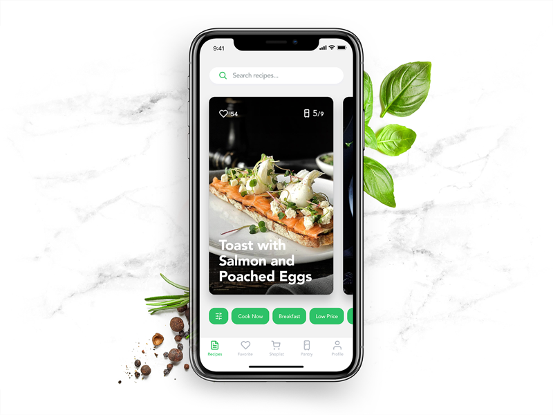
An example of a great cooking app design (image by tubik)
In today’s article we’re going to share with you our insights on how to make own recipe app MVP and then enhance it with a bunch of cool features. Read on, it’s going to be yummy!
📱 Basic Features: a Must-Have for Your MVP
When surfing the Web, you could find articles about all different types and modes of recipe apps, as well as other really sophisticated stuff. Frankly speaking, they don’t help a lot when it comes to building a recipe app.
On the contrary, they just leave readers even more confused. We at Stormotion decided to choose a more straightforward way and supply you with everything you need to create a recipe app: features, tech tips & estimations.
In fact, our first stop today is the list of essential features; just like an apple pie can’t be made without apples, your cooking application can’t be developed without these features. Let’s discuss them!
List of Recipes and Ingredients: Where to Get One?
Since you’re building a recipe app, these sacred pieces of information on how to turn separate ingredients into something tasty should mean the world to you. Without them, your application doesn’t make sense.
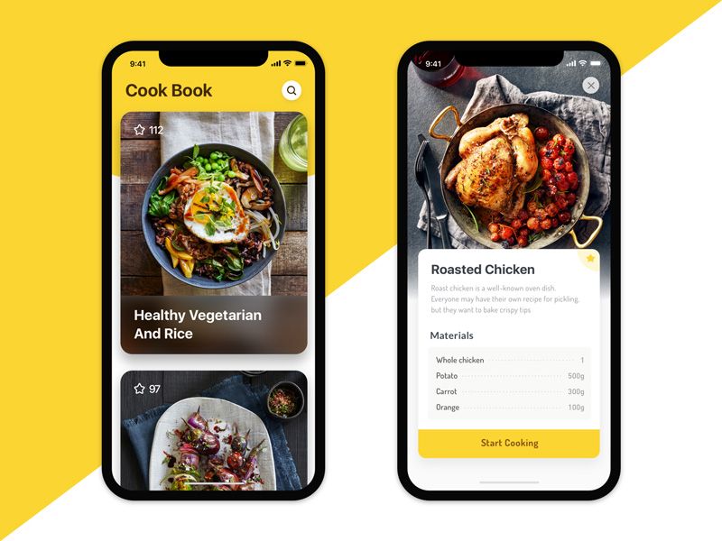
How are you going to fill your cookbook? That's one of the most important questions for you (image by Plankton)
But how can you get them? This is the most challenging thing for anyone who thinks about building such an app.
There are 3 ways to fill your mobile app with recipes:
- Integrate already existing databases of recipes and/or ingredients by using free/paid APIs (look for some options in the “tech tips” section).
- Create your own database.
- Let your users upload their recipes and fill up the application in such a way.
Each approach has its strong and weak sides.
If you’re thinking about API integration, here are the main pros and cons:
Strong Sides:
- Pre-made databases include thousands of recipes and ingredients, so you’ll have a pretty good base to start with from the very beginning.
- This is the fastest way — you just integrate a ready solution into your application.
Weak Sides:
- Really good databases aren’t free and will cost at least $99 and more per month.
- You depend on someone else — they may stop supporting the database or change the pricing policy and you’ll have to adjust accordingly.
- If you start using someone else’s DB, you need to carefully think about what added value you will give to your users nevertheless. Because… everybody can use that DB, right?
- If you’re building a cooking app for a specific niche — it’s difficult to filter pre-made DBs.
Building your own database is a good solution if you want to stay independent. Yet, it has own disadvantages as well:
Pros:
- You don’t depend on someone else.
- You keep your core business values in-house.
- You get only what you need. Public databases include a wide range of recipes that may not necessarily make much sense for you if you’re building a niche app (e.g., an app just for vegetarians or an app with just dessert recipes on it).
- You are free to create content that your competitors probably don’t have.
Cons:
- It will take quite a lot of time and resources to set up and maintain such a database from scratch.
Finally, the so-called “social cooking apps” that rely predominantly on users themselves also have both benefits and drawbacks:
Advantages:
- You don’t have to compose the database — your users will do it for you!
Disadvantages:
- You have to put a lot of effort into the moderation of users’ recipes. Otherwise, your app will turn into a dump pretty soon (repeated recipes, low-quality content, etc.).
- In the early stages, you have to encourage users somehow — a few will want to use the empty app and be among the first to fill it out.
- You need to find early adopters and motivate them to constantly post relevant content.
Also, nobody is telling you that you can’t combine different approaches while building a recipe app. In fact, that’s exactly what we at Stormotion recommend you to do! Here are the 4 best combinations to remember:
🥇 Leading Approach | 🥈 Supplementary Approach | 📃 Description | |
|---|---|---|---|
Pre-made database | Your own database | You’ll have a big pre-established database which you can improve and “supplement” any time with your own content (to stand out from competitors, target particular niches, etc.) | |
Pre-made database | Users’ recipes | Enlarge the database with new users’ recipes and their variations of already existing ones | |
Your own database | Users’ recipes | In this cooperative model, you can fill up your database with your own content but let users upload their recipes as well | |
Users’ recipes | Your own database | Upload only a narrow amount of the most popular/basic recipes on your own and encourage users to share their versions of these dishes and other recipes | |
Which one to choose to build a cooking app? Depends on your goals, niche and business model.
However, if it seems challenging to you, you can always contact us using the button below the article and we’ll try to help you figure it out.
Step-by-Step Instructions
Your whole target audience (regardless of age, sex, etc.) can be divided into 2 big groups:
- People who are proficient cooks and are just looking for inspiration & new ideas.
- People who are in need of guidance with cooking.
During cooking app development you should keep the second group in mind. The best thing you can do for them is to implement step-by-step instructions in a clearly distinguishable way — whether it’s a separate screen or a dedicated table.
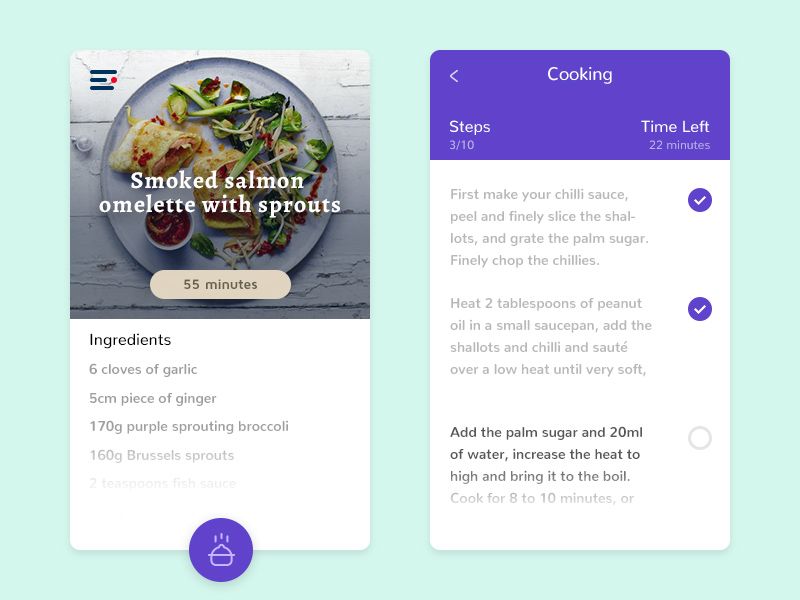
Step-by-step instructions in a cooking app (image by Pavlo Aliko)
You can improve this feature by adding related photos to each stage of cooking. Having descriptive pictures can significantly improve the UX.
Looking for more ways to improve step-by-step instructions? Read on, we’ll share them in the next section!
Personalization Block: Let Users Add Recipes, Comments & Bookmarks
We all have different preferences and habits when preparing food, and your cooking or diet and nutrition app development should reflect these diverse needs. That’s why we believe some personalization features should be in your application in one way or another.
First of all, you can make it possible for the users to upload their own recipes. They can either be private or public. In the first case, each user will be able to only see his/her recipes and the ones that were shared publicly; therefore, no moderation will be needed. In the second case, anyone will be able to see each other’s recipes, so moderation from your side will be needed.
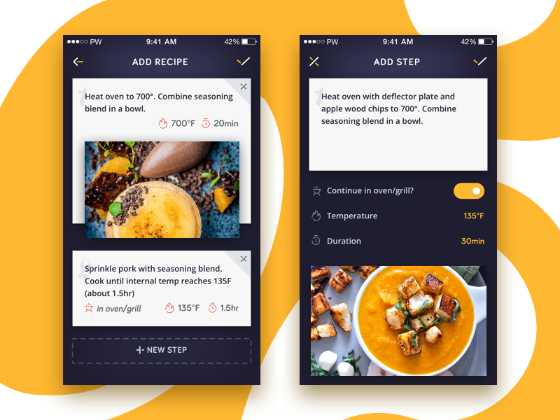
A great implementation of the "add a recipe" feature (image by Maria Shanina)
Secondly, you can deliver more personalization by letting users leave comments. And even more interesting — getting into discussions with the author. Thus, they will be able to share their own hints & tips regarding particular recipes or simply express their thoughts about the dish.
Thirdly, an absolute must-have is bookmarks. The possibility to save favorite recipes is essential for many users, so don’t neglect it during cooking app development.
Searching & Filtering
The searching and filtering function is extremely important for both advanced culinarians and cooking amateurs. That’s why it’s important to take care of these features when you create a recipe app.
The search usually goes by the name of a dish or an ingredient. In the second case, the user gets the list of dishes in which the mentioned ingredient is among the main ones.
Here are the components of a great searching feature:
- Visibility — users should be able to easily find it.
- Autosuggestion — to auto-complete users’ requests.
- Ability to search recipes by characteristics (like sweet, low-carb, gluten-free, and so on).
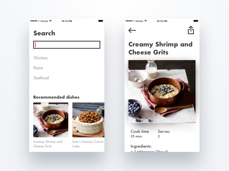
A quite minimalistic and nice-looking searching screen (image by antonleogky)
Also, it’s impossible to build a cooking app without a good filtering feature. It helps to narrow down the search results by setting additional requirements.
And that’s where you can get really creative. Some of the possible filtering options include:
Filtering option | Example |
|---|---|
Dish type 🍲 | Salads, sides, mains, desserts, soups, breakfast/lunch/dinner |
Cuisines 🍣 | French, Italian, Mexican, Chinese |
Particular ingredients in the recipe 🧀 | Tuna, cheese, eggs, potatoes, cucumber, apple, beef, cinnamon |
Diet prescriptions 🍚 | Low-salt, high-protein, grain-free, vegan |
Cooking time ⏲️ | <15, <30, <60, 60+ min |
Occasions 🎉 | Party, Easter, BBQ, Halloween, buffet dishes |
Ways of cooking 🥄 | Baked, fried, stewed, grilled, steamed |
Your own categories 🍩 | Quick & easy, on-the-go, cute, epic, bite-size, one-pot |
Of course, you’re free to add any other categories that, in your opinion, will improve the UX.
So, this was our review of the top features that are needed to create a recipe app. Let’s briefly summarize them:
- A list of ingredients and recipes.
- Step-by-step cooking instructions.
- A block of personalization features ( recipes, the option to add comments, and bookmarks).
- Searching and filtering features.
However, what technologies do you need to implement these features? Let’s find out!
🛠️ Tech Tips: How to Make a Recipe App From the Development Perspective
As usual, our Stormotion team prepared a list of helpful technologies that you may use during cooking app development:
- Yummly, Spoonacular Recipes, BigOven, Edamam Recipe Search, Pearson, Food2Fork APIs — to integrate and manage lists of ingredients.
- Spoonacular Food Products, Spoonacular Ingredient and Nutrition, Edamam Nutrition Analysis, Foodpairing — to integrate and manage the list of ingredients.
- Qloo API — to enrich the search feature with autosuggestion.
- Facebook SDK — to implement a quick Facebook sign-in option.
- Google Places API — to get the list of nearby grocery stores and supermarkets.
- Barcode API Overview — to scan ingredients' barcodes.
- Firebase SDK or Apple Push Notifications Service — to integrate push notifications into your app.
Finally, let’s find out what the average cost to create a recipe app is.
💰 What Are the Development Costs to Make Own Recipe App?
So, according to the estimations made by the Stormotion team, development costs are the following:
Basic Features estimated in hours
(using React Native)
🛠️ Features | ⌚ Hours |
|---|---|
UI | 30 |
Technical Foundation & Project Setup | 30 |
Recipes List | 45 |
Recipe Details, Step-by-Step Instructions | 75 |
Searching | 30 |
Filtering | 35 |
Suggestions | 25 |
Recipe Creation | 90 |
Comments | 35 |
Bookmarks | 25 |
Release | 20 |
🕰️ Total hours | 440 |
💵 Approximate costs | $19,800 |
Note: we took an average rate of $45/hour but it depends on many different factors so don't think of it as the final price.
Thus, it will take about 8-10 weeks to create such an app. The costs to build it start from $19,800. But, beyond development, you should consider the cost of maintaining an app to keep your recipe app successful long term.
However, we at Stormotion came up with another 7 cool ideas on how to make the recipe app even cooler during the post-MVP stage.
👌 Top 7 Advanced Ideas to Improve Your Cooking App
# 1: The Discovery Screen
In many cooking apps this feature is also known as “home screen”. However, it doesn’t really matter what you call it. Its main goal is to keep people engaged with your app as much as possible. How does it work?
On this screen, the most relevant recipes for a specific user are usually shown. For example:
- If the app is opened in the morning, you can suggest a few breakfast ideas.
- Or you can share special holiday recipes during the week before the holiday itself.
- It’s also a good idea to post a “recipe of the day” in different categories (like dessert, healthy, kid-friendly, and so on).
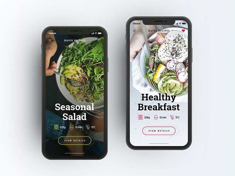
A "quick recipes" section in a cooking app (image by Miro Koljanin)
# 2: Video Guides
To improve the UX, you can also build a cooking app with video guides. It’s been proven that people are more receptive to visual information so take advantage of it!
Moreover, this feature may be extremely helpful to people who aren’t proficient cooks. Actually, for some of them, the presence of video guides in the app may be one of the most important factors.
# 3: Shopping List
Oftentimes, users find a great recipe but can’t cook the dish due to the lack of ingredients. Let them have a shopping list right in your app!
This will encourage people to use the application even more frequently (not only when they’re preparing food but also while shopping).
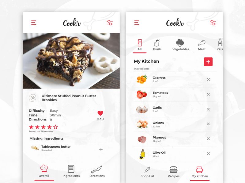
Shopping list is a great addition to a cooking app (image by Alexandru Circo)
Tip: don’t forget to develop a special button that allows adding all the ingredients from the current recipe to the shopping list.
# 4: Grocery Store Locator (+ Price Comparison)
This feature is definitely not among the high-priority ones but as you grow, it may be a nice addition to your application.
With its help users will be able to locate nearby supermarkets/grocery stores. You can either:
- Show all stores by simply taking this information from Google Maps and implementing it into your app.
- Alternatively, if you want to make the UX of your application even better, show which stores have groceries from the shopping list and where they’re going to cost the least. To get this info, you’ll have to use some external APIs (like Preisente API).
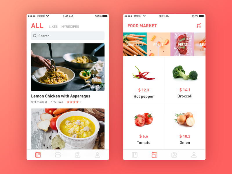
Having a price comparing feature will be helpful to many users (image by Loong)
# 5: Voice Commands (Hands-Free Mode)
While preparing food and using a cooking app, people usually have only 2 options: either wipe their hands every time they need to touch the screen or smear the device with their “dirty” hands. However, with a hands-free mode, your users can relax.
By simply saying “next step” or “go back,” they can navigate through the recipe they’re following and concentrate on the process itself instead of risking dropping their iPhone in the boiling soup.
# 6: Additional Ingredient Info
SideChef application’s ingredient section is a true inspiration for cooks. If you’re wondering how to make a recipe app with an improved ingredient info screen — that’s gonna be one of the best examples for you.
So, here’s what you can place on this screen to make it more useful for your users:
- A general description of each ingredient.
- Select & store hints.
- Cooking tips.
- Seasonality — mostly for fresh produce.
- Health benefits.
- A list of recipes that include this ingredient.
And, of course, when making this screen, don’t forget about the main rule of cooking app design — everything should look absolutely delicious and literally mouth-watering! 🙂
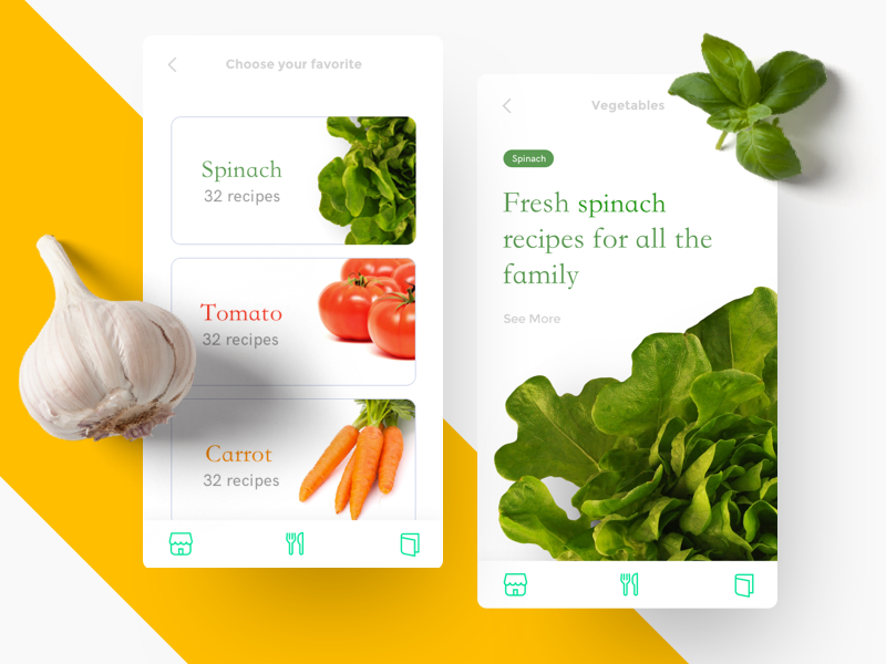
Ingredients info is a great additional feature (image by mikibrei)
# 7: Food Scanner
This feature allows scanning barcodes or ingredients via your device’s camera. After that, users can get a list of recipes which include the scanned ingredient.
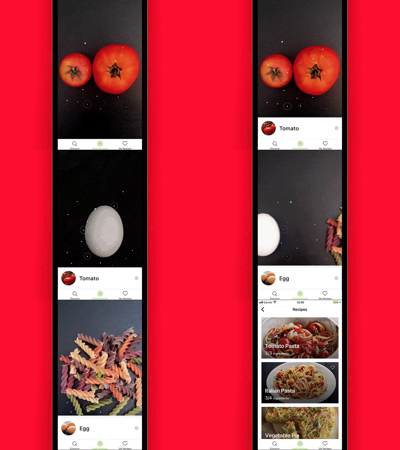
Just look how awesome it is! (image by Ksenia Butyrina)
💡 Takeaways
These were Stormotion’s insights on how to make a recipe app. We hope this article was interesting and useful. Let’s briefly remember the key points.
The must-have features for your application include:
- A list of recipes and ingredients (integrated or manually compiled).
- Step-by-step cooking instructions.
- Searching & Filtering features.
- Bookmarks, comments and a private cookbook.
Gradually, you can improve your app with the following features:
- A discovery screen.
- Video guides.
- A built-in shopping list.
- A grocery store locator with a price-comparing feature.
- An advanced ingredient info screen.
- A hands-free mode.
- A barcode scanner.
Have a great idea for a cooking app? Challenge us and we’ll help you to bring it to the market.

![Stormotion client David Lesser, CEO from [object Object]](/static/93e047dadd367691c604d8ffd1f54b58/b0e74/david.png)


