Nowadays most people can access their bank accounts from phones and laptops and conduct most transactions there.
Offline branches are still needed to make more massive operations like real estate purchasing, loans for big amounts of money, and others. However, their necessity gradually decreases.
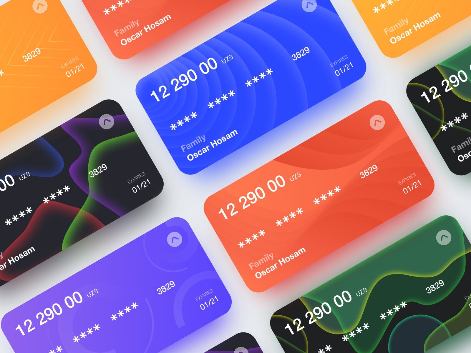
Bank websites are often used by financial institutions such as bank and other parties in the banking industry (image by OSCAR™)
According to Juniper Research, the number of online banking users is expected to reach 2B by the end of the current year, doubling from what it was 5 years ago.
It shows us that starting a fintech company and providing banking services online is easier than ever— the world keeps getting digitized and the banking system isn’t at the tail end.
Before we dive into details of a banking web app or site development. We’ve prepared this poll for you to see how often you use both options.
Interested in how to build a banking site now? Hold the line — we’ll show you how.
💳 Bank Website vs. Banking Web App: What’s the Difference?
Usually, when people hear the word website, they instantly think that this term covers every web-based platform. However, it’s not true.
Many “websites” should be considered as web apps due to several reasons.
But before that, let’s dot the i's and cross the t's with the terminology part.
Without getting into tech details, a website is simply the collection of content. It can be texts, videos, audios, pictures, and so on.
Most of us attend fintech websites and consume information there. To help our future selves let’s take a look at one of the biggest US bank websites.
🏦 Citigroup Case Study |
|---|
Citi is a US multinational bank corporation headquartered in New York City and known as the third largest among banks in the USA. On their website, they provide information about credit card opportunities, various banking and investment services, have their blog linked, and share their progress stories. |
Let’s sum up what functions the website has:
- Inform clients about Citi services.
- Promote their blog and personal brand.
- Share various press releases and Social Media news.
- Have links to Social Media accounts if there are any.
- Carry their mission and values.
If you look at it closely, you’ll see that the main purpose is to deliver information. Now, remember this point, please.
The player №2 is a web app (or web application). It’s an application that runs within a browser — just like a web page. Yet, it allows users to manipulate data as well as access it.
You likely use web apps every day — from Facebook and YouTube to Amazon and the web version of Spotify. But let’s keep it the “banking” way and look at the relative web app.
💳 American Express Case Study |
|---|
American Express is an American financial corporation headquartered in NY. They’re most known for their credit card, charge card, and traveller's cheque services. Their web-based platform is considered to be a web application. They allow users to create banking accounts, take loans, make savings and investments, do transactions — basically, everything you can do in an offline banking department. |
So, their web app is intended to allow users to:
- Access the account.
- Conduct transactions.
- Apply for a card.
- Take loans.
- Make savings and investments.
Of course, the “inform clients about their services” function still exists. But the key here is functionality.
Now that we reviewed cases of both solutions, we can tell that the crucial difference runs like a thread through every single word. A website informs, a web app allows interaction.
Keep in mind, the two aren’t mutually exclusive — it’s just the main purposes that are different.
Now, let’s dive a little deeper at the mentioned points and see a couple more differences.
Interactivity 📲
We’ve mentioned interactivity as a crucial difference that sets websites and web apps apart.
With web apps, users can manipulate content — like in our American Express example — which makes them more responsive compared to websites.
Normally, the “dialogue” between the page and users happens when the user performs an action: for example, they apply for the card, and the application responds by asking for the name and phone number.
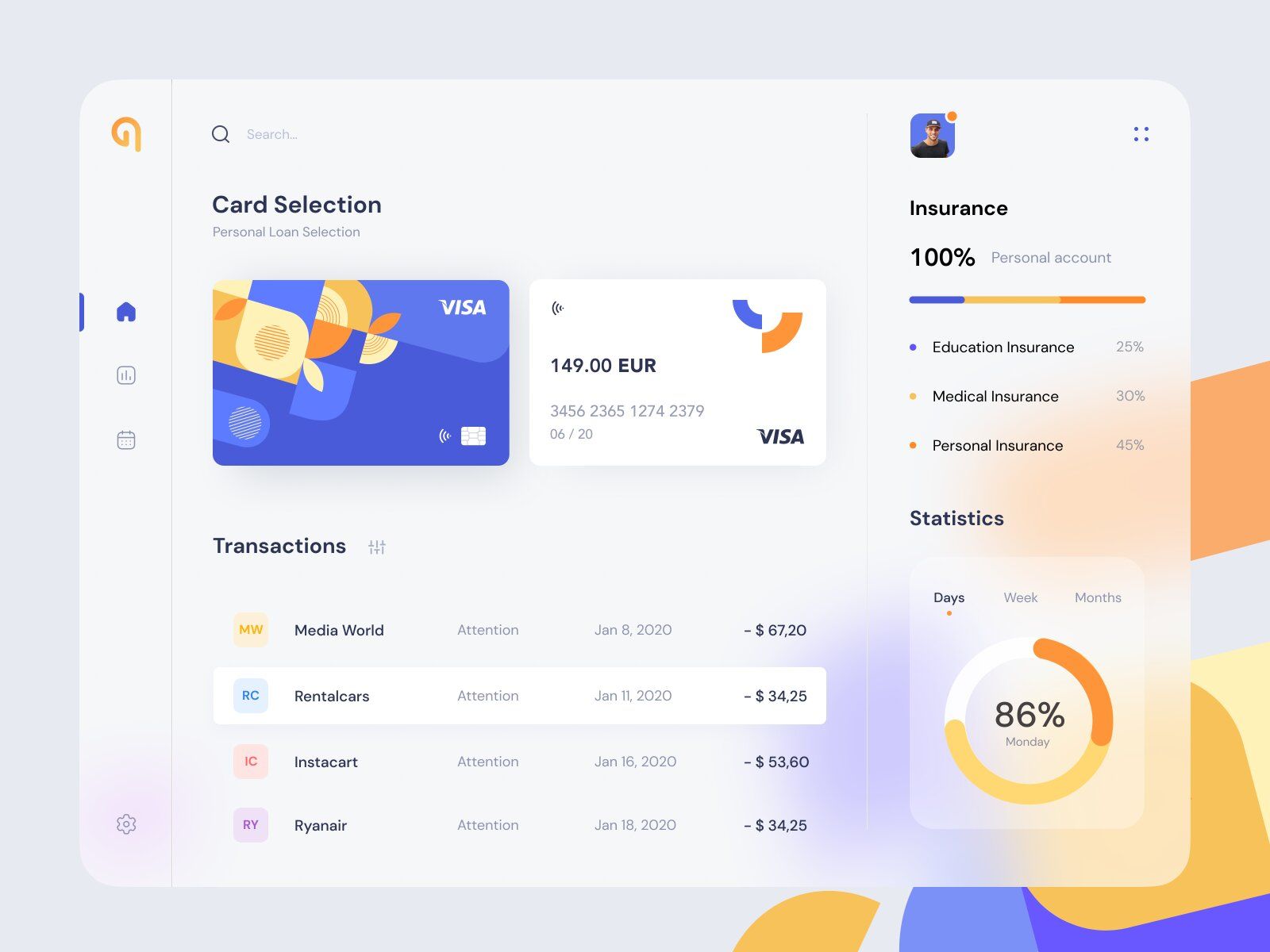
Bank websites and bank web apps differ from one another in interactivity that each software provides (image by Karina)
Thus, instead of giving static information with no opportunity to take any action except for viewing and reading, you can purchase, download, share, order, etc. — this interactivity makes the site a web application.
Authentication 🔍
This is quite an obvious point, yet nobody really pays attention to it.
The authentication isn’t obligatory on a website — you don’t need to type in your personal details to read the “How to apply for the card” guide.
However, authentication is usually a must for web apps. If you want to visit a web app of any bank,, you most likely will have to be a client of that bank. Thus, sign Up/In based on some authentication features is needed to identify you as such a client.
Let’s say you have a card at any bank with a web app. To pay for utilities with it you’ll most likely have to enter your account (type in a phone number, card number, password, CVV2, etc.) from the web app. Makes sense, doesn’t it?
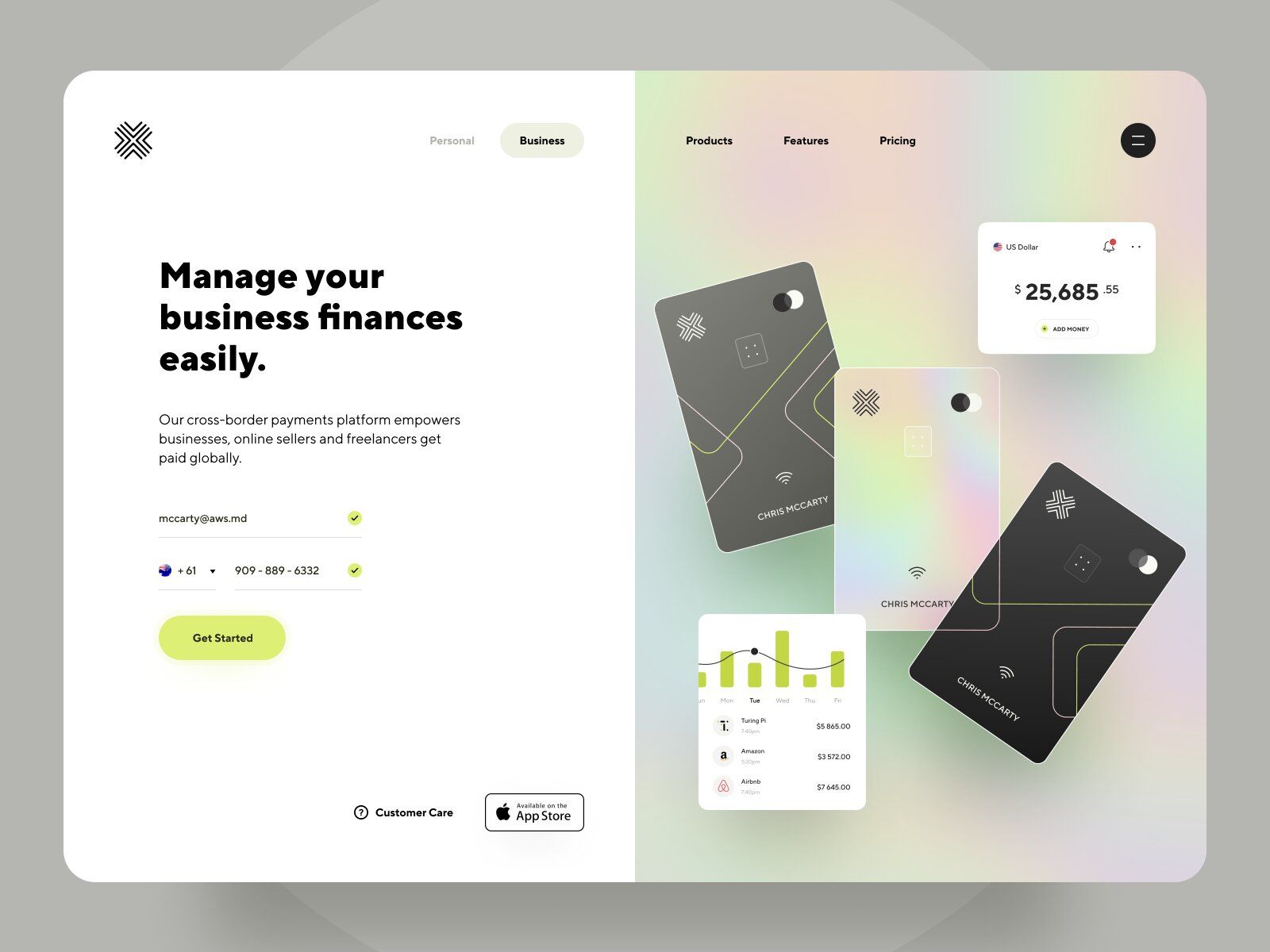
Authentication with email and phone number on a online banking website or mobile software should be easy yet secure for a pleasant customer experience (image by Anton Mikhaltsov 👨🏻🎨)
Sure thing, both options may require authentication, but in web apps it happens more often since the level of interactivity and complexity is usually higher.
Besides, the complexity of web apps is higher which derives from their functionality. Thus, the security layers have to be stronger compared to websites.
And cut! We’ll get back to this point.
Security 🔐
As mentioned above, security is another point of difference.
If it’s a fintech website, multifactor data protection is preferable yet not essential. With a web app, it’s one of the first things you should think of.
This can be explained by the amount of personal information it stores. Especially with banking ones, the data is worth its weight in gold and attracts hackers and frauds like a magnet.
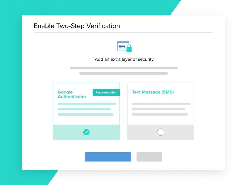
Any business, project, or financial institution in the banking industry should provide a good level of site security by using different sources of it (from secure authentication to financial regulations compliance) (image by William Newton)
Banking web apps often include these types of data protection:
- Multi-factor authentication.
- End-to-end encryption.
- Device fingerprinting. Attention! Don’t confuse the term with fingerprints as a biometric scanning. Device fingerprinting combines different sets of signals of a device — operations system, browser, screen size, IP address, language, location, time — to identify it as a unique device.
- Behavioral analysis.
- Real-time fraud alerts (emails, calls, etc.).
- Regulations compliance (GDPR, PCI DSS, etc.).
If you’d like to learn more about these security features and regulations, check out this article:
Complementarity 🎭
This is not exactly the point of difference. It’s the one that’ll greatly summarize all mentioned above.
Most companies don’t use only one out of two options since the key purposes aren’t the same, as we already know.
The most popular option looks like this:
The first thing to pop up on the Internet if you browse the name of your bank is the website. After you click on it, one of the first sections you’ll see is the web app often named “Online banking” or “My account” linked on the website.
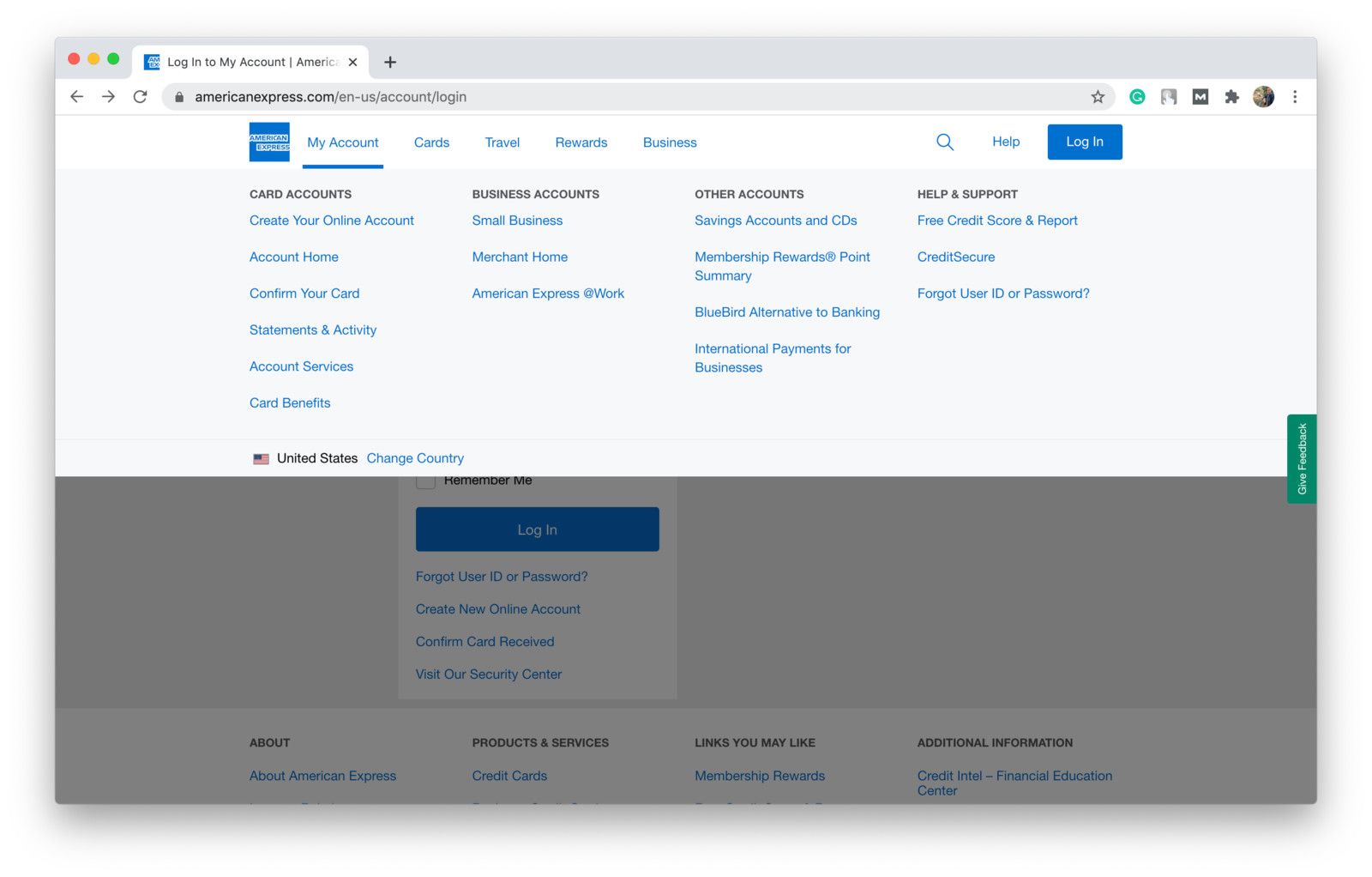
American Express “My account” example (shot from American Express)
Of course, you can organize your online projects in any form you want since both websites and web apps are intended to improve the user experience. In addition to websites and web apps, many banks are now exploring how to create your own kiosk app, offering customers quick, self-service access to transactions in branch locations.
But remember, depending on the purpose you pursue, the website or web app may fit your business needs better.
🔝 Top Things to Pay Attention to During Bank Website Development
In this section, we’ll present a couple of things worth attention when creating a banking website or web app.
Intuitive and user-friendly design 😊
When starting a fintech company online, dedicate some time to study the best bank website design solutions on the market.
Well, one answer can’t be suitable for everybody, but it has to be intuitive and user-friendly for sure.
I think we all know the situation when we can’t find the information we need on the website, spend quite a while there, and then just leave — irritated, without getting what we wanted to.
To prevent this customer outflow, the web app should:
- Be based on navigation patterns familiar to your users — intuitive.
- Have all features accessible at one-two clicks.
- Offer personalization and customization options (mobile version, mode for visually impaired, customized avatar, e-mailing, etc.).
- Conduct all transactions quickly, without delays.
If you want to get a clearer picture of what the design could be, you can look for banking websites designs on the Internet and research your competitors’ designs.

Any business, bank, or financial institution with such a site or mobile software should provide intuitive design for pleasant user experience (image by Mira)
Implementing well-developed search functionality is also a way to make a user-friendly and intuitive design. What is important here is for the website to be able to train and precisely pull keywords.
Let’s play out a situation:
You’re a regular customer willing to take a loan. How would you type this in the search bar?
“Take a loan”? Or maybe just “loan”? Or “credit”? Hmm, maybe you’d like to use the word “lending” today? Perhaps you want to be precise and type “loan for an iPhone”?
Don’t worry, we don’t know either. That’s exactly why keywords are so important — different clients call products by different names.
Finally, balance is the key here. Don't sacrifice functionality in the pursuit of beauty.
Customization & Personalization 🙌
Customization is one of the strongest advantages of online banking web apps. A well-developed customization system can significantly improve your retention rates and users’ engagement.
Why does it work so well?
First of all, values are different nowadays. Millennials and Gen Z care more about emotions and customization than many people who are 40+ years old do.
They need to be shown empathy, entertained, and loved.
It can be done via friendly reminders to do something and “Have a good day” notes, using names or nicknames instead of “You”, having your unique features (like special phrases, items, symbols, etc.), and so on.
One more reason why customization works so well is because it creates a feeling of a personal approach. And when users are treated personally, they are willing to spend more time on a web app and use its services more frequently.
It not only improves the user experience but helps you increase sales as well.
Customers really values when banks or any other business provide personalized experience in their project or on online banking website (image by Halo Web)
Which offer do you think will attract more attention?
# 1: Hey, there! We have an amazing offer for you. This weekend we’ll present our new investment strategy. If you’ll pre-order it within 24 hours, you’ll get a 25% discount. Don’t miss the chance!
# 2: Hi, [Name]! Hope you’re doing well!
We saw you started investing in [where they invest] for the past few days. We’d be glad to help you better structure your investments.
This weekend we’ll launch the new strategy from our financial advisor whose investment strategies you follow :) We’ll leave you a 25% discount coupon in case you’re interested.
Stay safe!
Your [Name].
Now let’s review both cases.
In the first one, there was no personalization. Just general phrases like “hey, there”, “for you”. Probably, not the best decision if you want to run a successful marketing campaign.
The second one shows that the company cares about its clients in the beginning before speaking about the offer.
Moreover, it shows why this offer will be useful to the client. This is a very important part — not sell, but help.
And only then we’d recommend making the offer in a friendly way, maybe even more as a notification, to create a kind of “Just to let you know” vibe.
Don’t forget to add “Stay safe”, “Best wishes”, or whichever wish you want to let the client feel treated personally again.
One more point we’d like to pay attention to is the discount.
Both options had it but only one had the time limitation. It’s not a bad thing, it’s intended to kind of force users to think faster and make them worry about losing the chance.
But it can work in the opposite direction. If 24 hours expire (meaning the discount isn’t relevant anymore), users may think that they don’t want this set anymore. Result: the company loses clients.
Thus, be careful with such limitations and don’t be too intrusive with them.
If you have more thoughts on how to improve any of these offers or want to share your opinion, feel free to drop us a line — we’d appreciate it!
Device Differences 💻
It’s quite obvious that different people may use different devices to use your services, isn’t it? So why don’t we take that into account and create a banking web app that’s optimized for PC, tablets, and phones.
Besides, not only the devices matter. The browser, the operating system, and its version, screen size, etc. — all of it should be considered.
You can make sure that your platform is optimized for each case by:
- Running pre-tests on different simulations. Additionally, you can test the security and intuitivity of the use.
- Gathering metrics, running surveys, and collecting feedback on user experience for the analysis.
It’s important since you might lose potential customers if the web app won’t be optimized for their devices, browsers, OS, etc. The optimization works rather attractive for the client — impeccable website work means satisfied customers.
✅ Top Features of A Banking Web App
In this section, we’ll review basic and extra features that you can add to create a banking web app that’s functional, useful, and brings value to customers.
# 1: Sign Up & Profiles 🔒
The Sign Up stage is quite a tricky one.
On the one hand, you can’t ask for too much information so that the process won’t be repulsive for users.
On the other hand, this is where you can implement many security features to create multiple layers of it (password, additional personal questions, phone number, and email confirmation, etc.).
And it’s quite a challenge to strike the balance. At the end of the day, nobody wants their data to be stolen, thus, you can add as many security features as it’s needed to create a reliable barrier between frauds and users’ data.
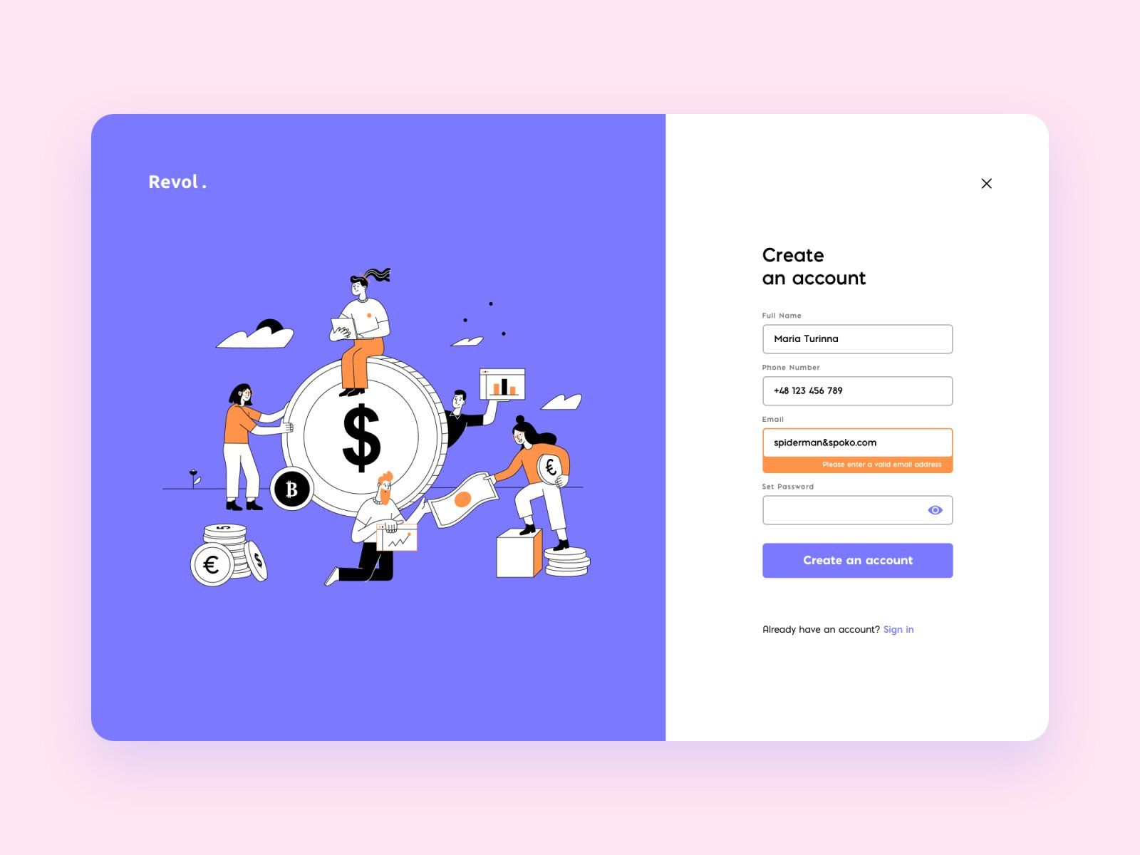
A sign-up on the bank website or software for banks and any other financial source should be easy yet secure (image by Merixstudio)
Besides, make sure that customers are acquainted with Confidential Policy and other terms they accept by creating an account. All of it should be done at the Sign Up stage.
In terms of users’ profiles, this is a great place to add customization features and improve engagement. You can add:
- Turn on/off double conversion.
- Set the limit to online payments/credit.
- Add trackers (savings, expenses, etc.).
- Automatize investments.
- Set payment reminders (maybe as emails or reminders on a calendar).
# 2: Home Screen 📊
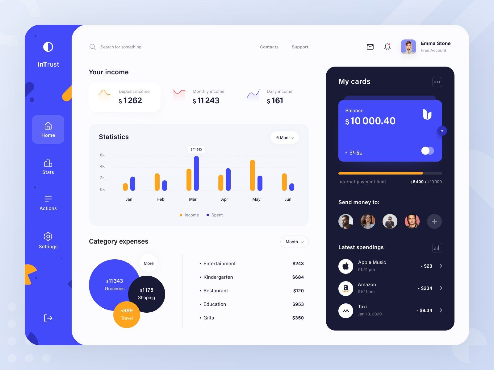
The Home Screen is considered to be the main screen where users can access the main features and see their accounts’ details. It can contain:
- Balance details. It could be either for one most used card or each card separately (if there are several).
- Wallet. This feature is used to provide quick access to all cards and perform actions upon them.
- Last payments and transactions list.
- Quick access to main features — transfer, utilities/phone/etc. payments, currency exchange, etc.
- Support service contacts.
- Calendar.
Banking web-based software should have a Home Screen with a user-friendly & management system (image by Ariuka)
Moreover, it’s a great idea to make the Home Screen changeable. That is, allow users to decide what’s on their Home Screen — every man to his own taste, right?
# 3: Payments 💲
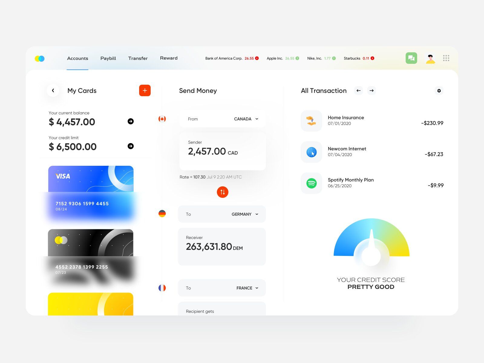
This feature is something any banking web app wouldn’t be a proper one without. A quick, functional, and reliable payment system can be your bargaining chip.
Nowadays we pay for many things via web apps. Thus, to keep up with the competition and potentially stay ahead of it, you can these payment options to your app:
- Deposits.
- Mobile top-up.
- Public services & utility bills.
- Loans & credits.
- Fines & taxes.
- Medical care & insurance.
- Travel & transports (bus, train, plane tickets, hotel or Airbnb booking, etc.)
- Games.
- Donations.
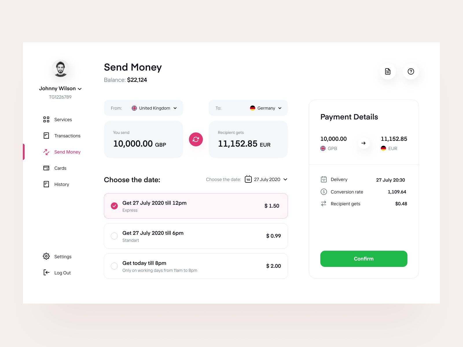
Transaction in a banking website or any bank web-based site should offer a site with several sources of payments (image by Vadim Drut)
Here you can also show the care for customers by offering:
- either an automated payment reminder system to customize (set the time & date, the amount of money, choose the card to transact from, etc.)
- or just reminders in form of emails or phone/messenger texts (if the phone number is connected).
# 4: Transactions History 📝
People take personal finance management much more seriously than they used to. That is exactly why a well-organized transaction tracking system is so important — to bring the additional value.
Some people may need this history as proof of payment to return their purchase, other as a report for their boss or company, and so on.
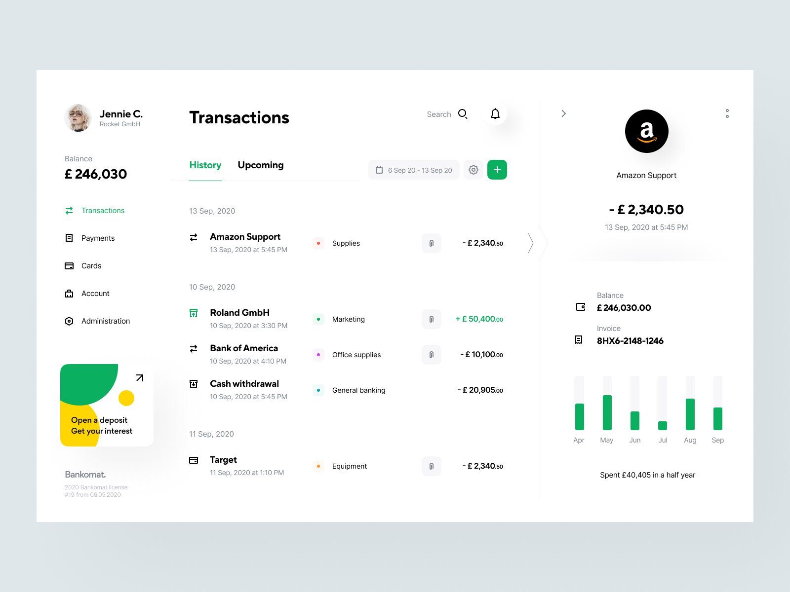
Transactions history of a financial site should contain all necessary information about them for great experience for customers (image by Vladimir Gruev)
Thus, the transaction information should consist of:
- Amount of money transferred.
- Recipient (either card number and/or name of person or company)
- Date & time.
- Additional: geolocation mark. Some banks do that for specific payment options (via PayPal, for instance).
Taking into account the number of transactions users can potentially conduct every day (even if it’s a morning coffee, bus ticket to the office, lunch in a cafe, and taxi back home, it’s already 4 payments per day), the list of payments will be quite long.
Thus, it’s reasonable to add various filters:
- By category (food, transport, utilities).
- By date.
- By the amount of money ($0-50, $51-100, etc.).
- By destination & others.
In combination with payment system security and its flawless work, this feature will create a great user experience and give you a strong competitive advantage.
# 5: Branches and ATM Map 🚩
Each person is different. Each situation is different. You never know when the map will come in handy.
Let us explain what we mean. Your map can be useful for:
- Anybody with a poor sense of direction.
- Someone new to the area.
- A person who doesn’t have time for seeking.
- Somebody who wants to know if there’s an ATM closer to their neighborhood compared to the one they’re using now.
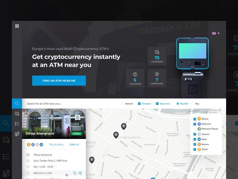
ATM Map can be implemented into a financial website for customers to get better experience (image by Marko Prljic)
If there’s no such feature, the user experience can be damaged — a person in a hurry couldn’t find the right ATM and was late to work, for instance.
To prevent these little inconveniences and don’t repel clients, a map is worth considering.
We’d like to give you a bit of general advice based on this situation:
Try to predict the situation, analyze what customers might need, show that you care — it’s the key to success!
You can make your map even more useful by adding a real-time queue counter, mark ATMs a customer uses most often, show if an ATM doesn’t have a certain banknote (“$10 ran out”, for instance) and so on.
# 6: Customer Support 📣
Customer support in banking organizations should be flawless.
No matter how well your web app is developed, little trouble and misunderstandings will most likely occur. The faster you solve them, the better users will think of you as their service provider.
So, support service should:
- Provide a chatbot (artificial intelligence programmed to solve simple troubles and deal with questions) and live chats.
- Be quick.
- Have a wide range of answers listed in the FAQ.
- Offer 24/7 phone support for an emergency.
- Provide a list of contacts, including email, various phone numbers from different operators, etc.
Nowadays many banks provide support via popular messengers like Facebook Messenger, WhatsApp, Viber, Telegram. Normally, users are redirected from the web app to the messenger.
📖 Top Features of A Banking Website
In this section, we’ll review the basic features and information a banking website should have.
Basically, it’s not much to talk about since the more information you provide, the more value your website brings.
However, there are some points we’d like to highlight.
So, your banking website can contain:
- Cards opportunities.
You can place the information about what cards you offer, what are the terms, bonuses from the cards if there are any.
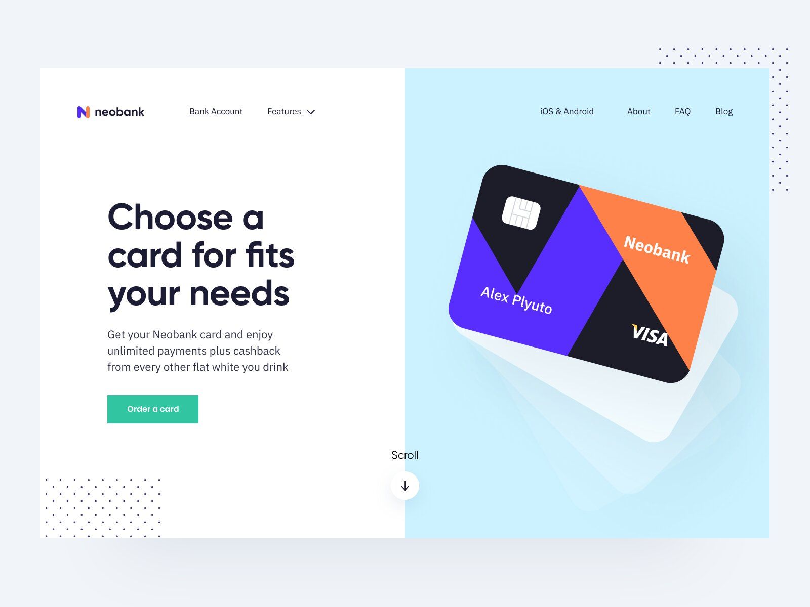
Customers should be able to access card opportunities on a financial site for better experience (image by Vadim Drut)
- Personal story & “About us”.
If your company has a story or your mission you want to share, the website is just the place to do it.
By doing it you promote your company’s brand and create a kind of history around yourself.
It really helps to build trustworthy relationships with your customers.
- Media.
If you have any Social Media accounts, press releases, articles, posts, a blog — anything that's about your company — it should be there.
- Services & activity.
It’ll be quite useful for your customers if you’d provide a list of services you provide, what documents they’ll need for it, and so on.
What’s also great is to share different social activities if you do them. It can be charity, career fair, intern recruitments, partnerships, investors, etc.
- Link to a web app (if you have one).
In case you have both a website and a web app, that’s a good idea to have them linked with each other.
It’s a great tool for self-promotion.
✋ How to Make Your Web Platform Mobile-Friendly
Nowadays many users prefer mobile devices to PC and laptops. According to GSMA Intelligence, there are 5.2B unique mobile users in the world, which is 102M more than it was a year ago.
It shows us that by not making your websites and apps mobile-friendly, you can lose clients.
It’s not only beneficial in terms of expanding your clientele but necessary since Google’s algorithms have changed.
At the moment, Google favors mobile-friendly web-platforms. Long story short, now Google ranks mobile-friendly banking websites designs higher for mobile searches. If you’d like to learn more, you can check out Google’s guide on this topic.
That is, even high-quality web platforms can’t be high-ranked for mobile searches if they’re not optimized for mobile devices.
Now let’s move forward to how to make it mobile-friendly.
Screen Size Adjustment
First things first, adjusting your website or web app to different mobile screen sizes is a must. Such an approach is also known as “responsive web design”.
It may seem like a tricky task — there are dozens of possible mobile screen sizes, especially when it comes to Android.
Yet, we won’t get into tech details since it’s not necessary. This is quite a common task for experienced web development teams so it shouldn’t be too challenging if you find the right Tech Partner.
Modern development tools allow to automatically adjust a website to several key screen resolutions, and thus to make it look native and pixel-perfect on different mobile devices.
Visible CTA buttons
It’s quite an important point since nobody wants their screen to be overwhelmed with call-to-action buttons.
The best thing you can do is use one CTA for one separate purpose.
Be it an email subscription, “Follow the link”, a call to purchase — there should be one CTA with a relative text content.
{ rel="nofollow" .default-md}*)](https://cdn.sanity.io/images/ordgikwe/production/c5e74738d6f234e89e470fb1cac64c67c366ca31-1200x900.jpg?w=1200&h=900&auto=format)
CTA on a landing page of a financial site can help your attract customer attention (image by Ruben Szekrenyes)
Moreover, it should be easy to spot and stand out compared to the main text. You can make it of different color, put in a geometric figure, etc.
Short Forms
Since it’s the banking web app, there probably will be many forms to fill in.
Thus, try to keep it as short as possible.
It’s much harder to type on the phone — customers can be on their way to somewhere, T9 always corrects the words — it’s just not convenient.
So, to make an email subscription you only need an email and maybe name. No phone numbers, questions like “How did you find out about us” — only essential information.
Long forms with too many additional questions may be rather repellent for customers.
Frameworks
There are a bunch of free and paid frameworks that can help you scale your website to any device.
Bootstrap is one of the most popular ones. It’s a front-end framework designed by Twitter to adapt websites to mobile devices quickly. It’s pre-built which frees you from having to code it yourself or with TechPartner.
However, it also means that you’ll be limited by what the pre-built framework offers. Moreover, if you use such, you’d have to check if it’s suitable for the goal you want to reach with this framework.
Simple & Responsive Design
If you want to be mobile-friendly, a simple and practical bank web app design might help you with this. Complex designs can make the website load slowly on mobiles which can be repellent.
It also helps to centralize the attention while a complicated fintech website design may be a bit confusing and work inversely.
When simple design is quite an understandable meaning, responsive needs to be explained. So, a responsive banking websites designs:
- Adjust a website to any screen sizes and browsers.
- Offer better readability (with help of automatically changeable fonts and colors for different devices).
- Detect multiple screen resolutions.
💡 Takeaways
As you can see, there are quite a few aspects you should consider to start a fintech company online.
Let’s sum up the main steps:
Choose a web app or site, or both.
Find features you want to add to your platform.
Find a TechPartner and start the development.
Have any questions on how to start a fintech company & build your own site unanswered? Drop us a line. We’ll find a way to help you!

![Stormotion client Alexander Wolff, CPO from [object Object]](/static/a16ba3c9580effc3ab9a68d115eadffe/b0e74/alex.png)


