In the mobile world everybody knows how a great UI may increase user engagement, retention rates and overall delight from using your application. And it’s impossible to imagine any really cool design without beautiful animations. So today we’re going to build one on our own!
More specifically, we're going to share with you our insights on how to make the nice AppStore-like animation with some interesting modifications. Let’s get it started!
👨💻 Step 1: Setup a Layout
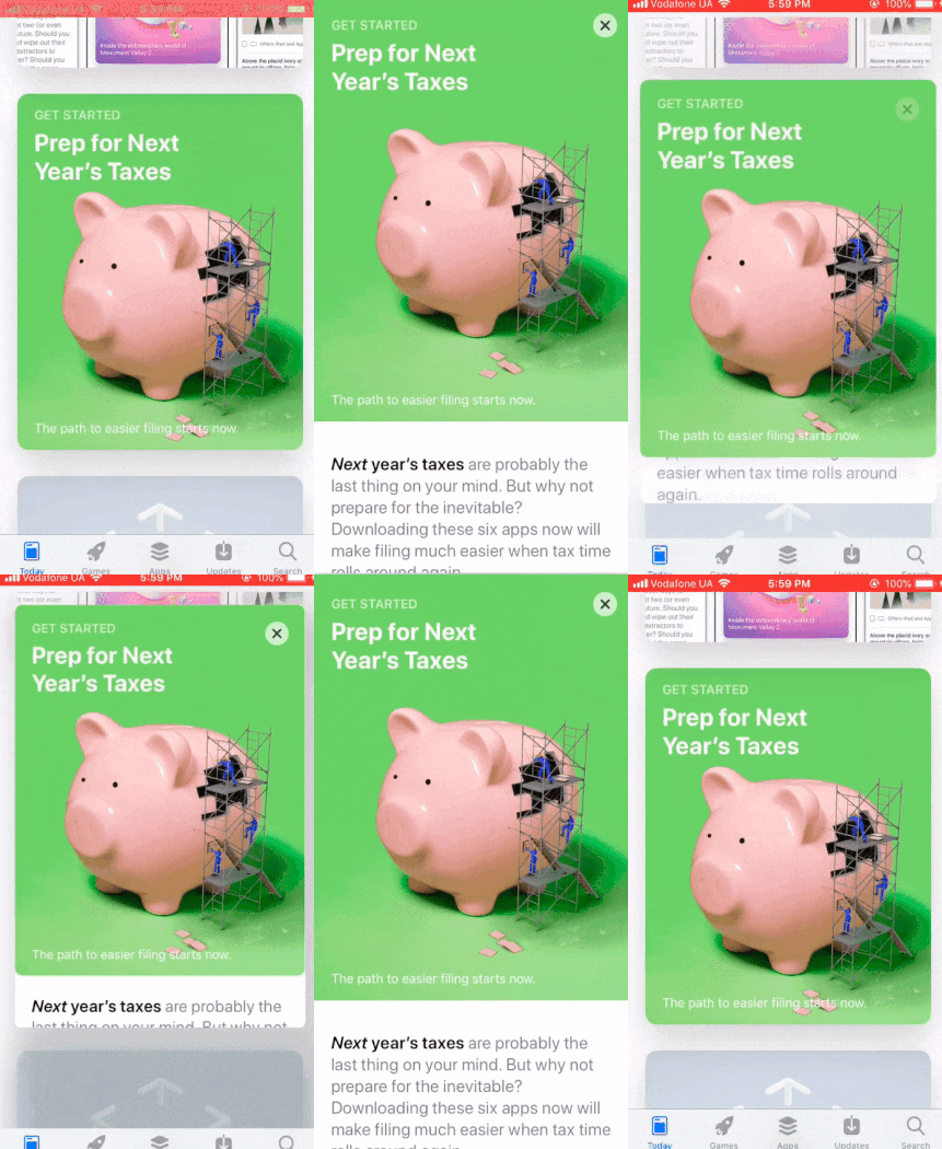
Looks pretty good, doesn’t it? We're going to develop a similar one!
First, let’s make a simple UI for our demo app. Since we’re developing it for iOS devices, our interface should be similar to AppStore’s UI.
NOTE: We're not aiming to make a perfect, scalable layout. The main goal is just to make a cool animation.
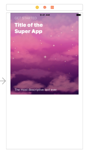
Our layout
Now let’s do some usual setup in our code:
At the moment our newly created demo app looks like this:
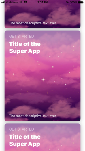
That's how our demo looks now
Finally, we have something to work with and are ready to create the outstanding AppStore-like animation. Let’s take a closer look at what should be done.
⚙️ Step 2: Developing the Animation
So what do we expect from our animation?
When you select a cell, this is what you should see:
- The selected cell expands to the full screen;
- Its corner radius equals 0;
- The status bar is hidden;
- The collection view’s isScrollEnabled is false.
When you tap again on the selected cell, the following things should happen:
- The selected cell collapses to its initial frame;
- The selected cell’s corner radius is back to its initial value;
- The status bar is visible again;
- The collection view’s isScrollEnabled is true.
So, if we translate this into the coding language, it will look similar to this:
Seems quite good. But where is the main part - our cool animation? It’s right here! 🙂
To build it, we’ll use UIViewPropertyAnimator. If you aren't familiar with it, we recommend you to go and check it out right now. It’s a truly awesome thing!
But let’s come back to our animation. To develop it, we will use UISpringTimingParameters, because it’s very similar to what Apple uses to create the animation in AppStore. Also, we’ll disable user interactions while the selected cell animates to avoid any unexpected behaviour. And then the code should be like the following:
Let’s see what we already done. That’s how cool we are:
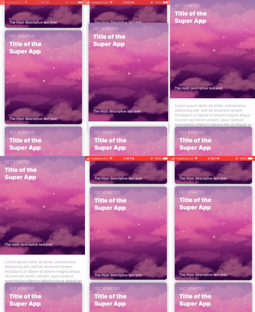
Hmm, looks like we forgot about the fact that each next cell is higher at the layer level than the previous one. At that moment we thought: what if… we’ll solve this problem and add a cool feature at the same moment?
Namely, we’ll force visible cells (except the selected one) to hide from the screen. Eventually, it should seem that the selected cell pushes the remaining cells off the screen. Let’s implement it and check how it looks!
🛠️ Step 3: Adding a Modification to Our Animation
First, we will add a new property called hiddenCells. We need to remember which cells will be hidden, so that later we can show them back on the screen.
And now imagine that our cells have “show” and “hide” methods. In this case the changes are really simple and should look similar to the snippet below:
Also, let’s take a closer look at what should be done in “show” and “hide” methods.
Hide | Show |
|---|---|
The cell should hide from the screen, and if it was above the selected one, it should go up, otherwise - it should go down (this is needed to create an effect when the selected cell kinda pushes all others off the screen). | The cell should back to its initial frame. |
To understand where exactly the hidden cells should move to, here is a small blueprint for you:
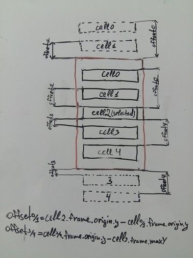
This is how hidden cells move
There's nothing complicated, so the code will look pretty simple, like the one below:
🏆 And Finally…
Let's see our final version!
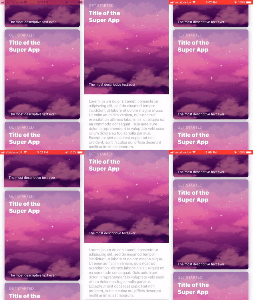
The final version of our animation
We did a great job since it really looks nice!
We hope you enjoyed this article. You can also check the full project on our GitHub.
If you have any questions, we will gladly answer them. Also we’re open to any suggestions so feel free to share some. All this you can do by hitting the button below. Have a nice day! :)


![Stormotion client Max Scheidlock, Product Manager from [object Object]](/static/33294af91c38256bcd5a780ddc41861a/b0e74/max.png)


