The meditation and therapist app development market is quite filled with great user-centric products, offering diverse solutions to users. There are dedicated meditation apps, as well as corporate health app development that integrates certain meditation features.
On the one hand, it makes it harder to stay ahead of the competition. But on the other hand, the diversity of existing use cases allows businesses to learn from others’ mistakes as well as adopt the best proven practices.
In this case study of 3 meditation & mindfulness apps, we’ll share some tips and tricks for meditation app development that you can learn from their products. Also, we’ll share our ideas on what can be done to achieve even better UX.
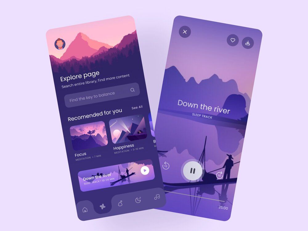
Best meditation apps often have a variety of meditation practice options like guided meditations, nature sounds, bedtime stories, etc. (image by QClay)
We’ll review the following market leaders:
So, if you want to get inspired by other meditation apps, take a look at how our meditation app development company can incorporate it into your development process — welcome.
😌 Calm
Calm is considered the #1 app for Sleep, Relaxation, and Mediation. Such a title was awarded to this app since they have the most downloads over the last several years.
The app offers hundreds of multi-day meditations targeted at various needs from improving self-esteem to dealing with anxiety. There are both voice-guided and unguided sessions lasting from 3 to 30 minutes.
It has customizable background sounds that are on while you’re scrolling an app. Additionally, the sounds change according to the background itself. For instance, a mountain lake background has running water sounds, while the flower field has the wind blowing in the background.
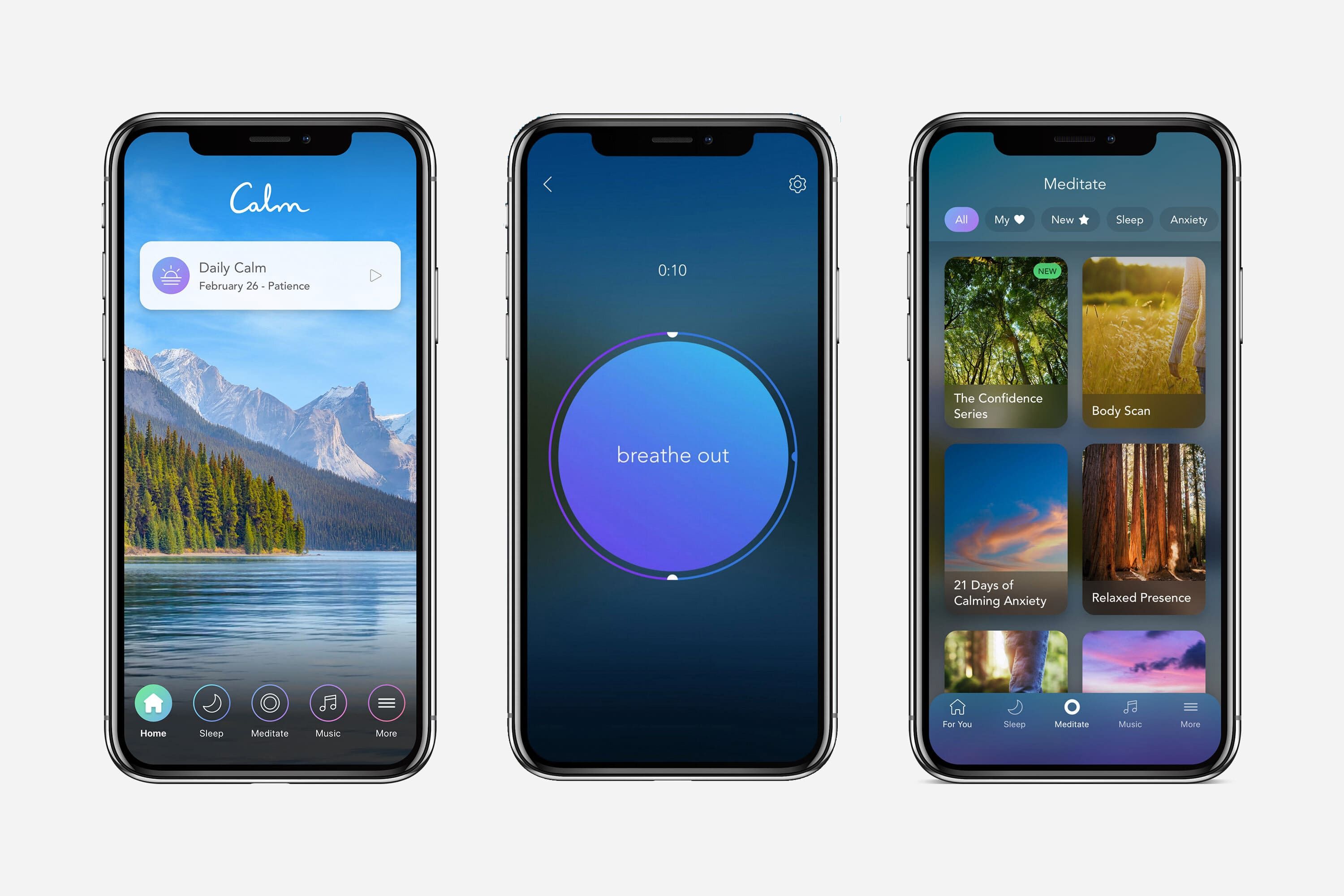
A Calm meditation app has a lot of guided meditations, self care practices, nature sounds, and mental health guided sessions (image by InsideHook)
Apart from meditations, it also offers breathing exercises, sleep stories, music, and remixes of famous artists and songs for sleeping, focusing, working, and so on.
This meditation solution is based on the freemium monetization model. At first, there’s some basic free content — only a couple of introductory sessions. Also, users get to experience a premium subscription for 7 days as a free trial. To continue using it, one would have to pay either $14.99 per month, $69.99 per year, or $399.99 for a lifetime subscription.
Calm had significant improvements when the COVID-pandemic burst. In April 2020, first-time Calm downloads jumped to 1.6 million, which is 36% higher, compared to January.
They also made the app free to 12.4 million members of the Kaiser Permanente health insurance company to help people deal with the lockdown stress.
Also, our experienced developers specialize in creating a personal training app with unique features.
Now, let’s take a look at what you can learn for this app to help your own product succeed.
Calm: Tips & Tricks 🃏
# 1: Separate Premium & Free Content with Visual Means
If your app offers both free and paid content, it’s essential to clearly distinguish them for users’ convenience.
For example, Calm has the lock in a corner of the premium content so that users don’t get irritated by a constantly popping up “Unlock Calm” Screen.
{ rel="nofollow" target="_blank" .default-md}*)](https://cdn.sanity.io/images/ordgikwe/production/00d2cb744577c74025e74397767d6dacea321ebc-644x1279.jpg?w=644&h=1279&auto=format)
Guided meditations practice is a big part of Calm’s mindfulness exercises that includes breathing exercises, anxiety relief, mood control, and other self care meditations based on guided sessions (image by Calm App)
However, such a look can be not noticeable enough so consider either making a mark bigger or use another way to single out the premium content (like shading the session picture).
Furthermore, you can simply create separate lists or screens for free and premium meditation content.
# 2: Keep your Brand Voice Consistent over all Products & Platforms
Calm’s app, its website, and message, which is to help people become healthier, happier, and calmer, are consistent. Even the greeting “Welcome to Calm” (previously “Meditation” made simple) emphasizes the end goal to have a better mental state instead of giving false hope for the easy way to an improvement.
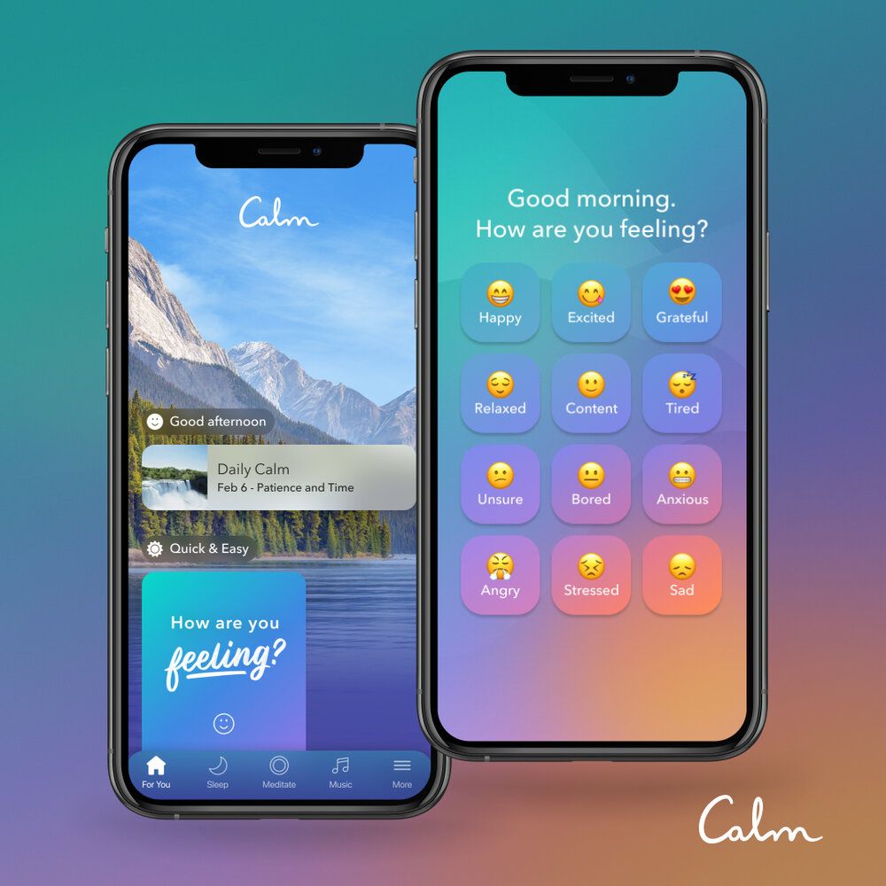
Guided meditations, breathing exercises, mood control, and other meditation and mindfulness courses are consistent with the brand (shots from Calm Blog)
Their advertisements are consistent with the brand voice as well. For instance, they have a contract with CNN for a 30-second ad with almost nothing but the sound of rain hitting leaves.
It was a hit on Social Media and brought Calm more than 9,700 mentions, compared to 500/day on average the week before.
So, what we’d like to point out is that:
- Consistency is important for building an image of your brand.
- If you’re consistent in all parts of the marketing, it can bring you high conversion rates.
That’s where mental health mobile app development services can help you maintain consistent brand voice, smooth UI/UX, and high-quality delivery across platforms.
# 3: Diversify & Update the Content
To reach a wider audience with your meditation product and cover the needs of as many users as possible, it’s important to diversify the content.

Meditation practice options in an app can include guided meditations based on mood control, focus, health and wellness habit tracking, sleep improvement, and other courses (shots from Calm App)
That means, apart from meditations, you should consider adding:
- Calming stories & tales.
- Different sounds like rain, wind, river, etc.
- Music. Like calming remixes of popular songs or lo-fi hip hop. By the way, lo-fi is proven to have a relaxing effect. Long story short, the music without lyrics with calm nostalgic sounds (like vinyl record clicking) has a perfect stimulative impact on one’s brain to reduce stress and increase productivity.
For instance, Calm provides stories for different groups of people (of different ages, tastes, interests, for different purposes, etc.). It includes reinterpreted fairy tales, general fiction, and many others.
Additionally, some stories are recorded by celebrities (Harry Styles, Bob Ross, Matthew McConaughey, and many others).
Furthermore, it’s really important to fresh up your app with new content regularly. If you won’t, there’s a chance that users would run out of content at some point. Considering the fitness app cost for meditation apps and allocating resources for continuous content updates ensures sustained user engagement and satisfaction.
If we take a look at Calm, it updates its content constantly. For example, there’s “Daily Calm”, which is a 10-minute guided meditation that’s updated every morning.
Aspects to Improve 📈
Even though Calm is considered the # 1 meditation & mindfulness app, there are certain aspects of it that can be improved. Let’s take a look.
# 1: Make Interactions with Users Customizable
The end goal of Calm is to help people improve their lives through meditating, which is a challenging and time-consuming process. Thus, many people require motivation boosts not to give up and achieve this goal.
In the Calm app, this impetus is enabled through daily push notifications & reminders. However, they’re always the same and not customizable, which makes it less efficient for a part of the audience.
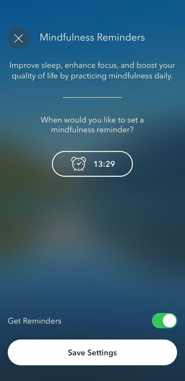
Guided meditations for mood control, breathing, life, health, wellness, and sleep improvement can be customizable for better user experience (shots from Calm App)
If these were customizable, users could write some meaningful phrases, their favorite quotes, or connect the motivation to meditate to a certain event in life, which is much stronger than a generic phrase, same for all.
In fact, the creativity here can work on full. If you don’t really want to make it customizable, consider creating several reminder options to choose from.
Another way is to allow users to choose who’ll be the reminder. Meaning that users choose a person and this reminder pops up as a note from them. Some people might feel much more motivated if they’re reminded to meditate by Jeff Bezos or Lady Gaga.
Furthermore, Calm doesn’t offer to customize the Home Screen. For users, it means that they always have to scroll meditation lists to find something they want now or liked previously.
So, we’d recommend you to allow users to:
- Add/lock sessions to/on the main screen.
- Give personalized recommendations.
- Synchronize reminders with sessions. Let’s say, that, by clicking on the push notifications at 11 pm, users are automatically transferred to the chosen session & others.
# 2: Implement Gamification Functionality
For meditation & mindfulness apps, much like when you build a yoga application, retention and engagement are the 2 most important metrics since it shows how dedicated users are. Gamification features work really well for improving these stats, which Calm doesn’t use enough, we’d say.
So, the app has:
- Metrics like “total sessions”, “mindful minutes” (aka time spent meditating), and “longest streak”.
- Calendar with information on when each session was made.
- Mood Check-Ins & History.
- Gratitude Check-Ins & History.
- Daily Calm Reflection & History.
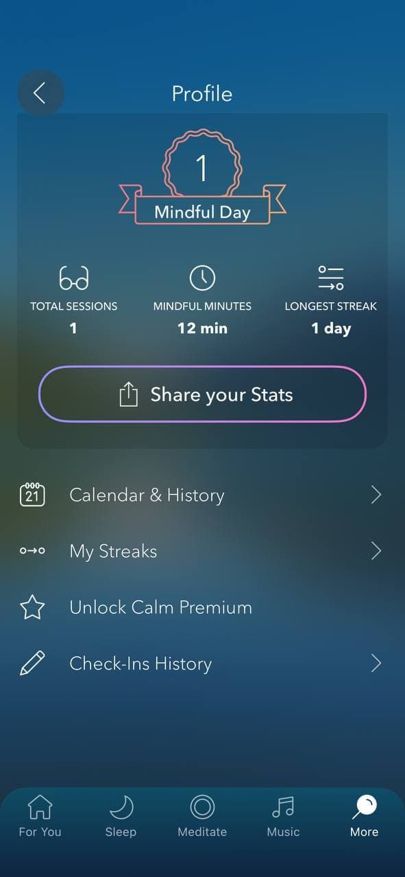
Gamification features can be a great reward for completing guided meditations, courses on health and wellness improvement, sleep, mindfulness improvement, etc. (shots from Calm App)
However, the possibilities of mobile apps in this field are significantly more extended. Apart from what Calm has, you could add:
- Personal goals setting. Even though Calm keeps track of streaks and total sessions, it’s not clear why users should be motivated. Yet, if they set a goal to reach a streak of 20 days, it makes more sense not to give up. To strengthen the motivation, you can offer some bonuses as a reward for streaks. For example, 1 premium meditation at no cost for a 10 days streak.
- Temporary challenges like “30 days sleep meditation”.
- Achievements & rewards. For example, you can add sessions that are only accessible after completing a certain achievement. What’s important here is that you should correlate the importance of this achievement for you as a business and a reward. A user doing 15 sessions in a row is not so beneficial from the business perspective as the one recommending your app to a friend. Thus, rewards for beneficial tasks should be higher.
- Leaderboards.
- Tiers and badges & others.
If you’d like to learn more about gamification opportunities, we have a section in the article dedicated to building up your brand loyalty & encouraging people to regularly use your app with help of gamification features:
# 3: Give Clear Instructions
Calm has a pretty great UX design in general. However, there’s still something to avoid.
We talk about the sign-up process — the app offers to do it with an email, Facebook, or Apple ID. If a user opts for the email option, they’ll be asked to create a password.
The thing is that Calm doesn’t accept any password, yet, doesn’t provide any information on what it should look like as well. Normally, an intrusion would be similar to “Use at least 8 characters, including one upper case letter, one number, and one symbol (@#%^*)”.
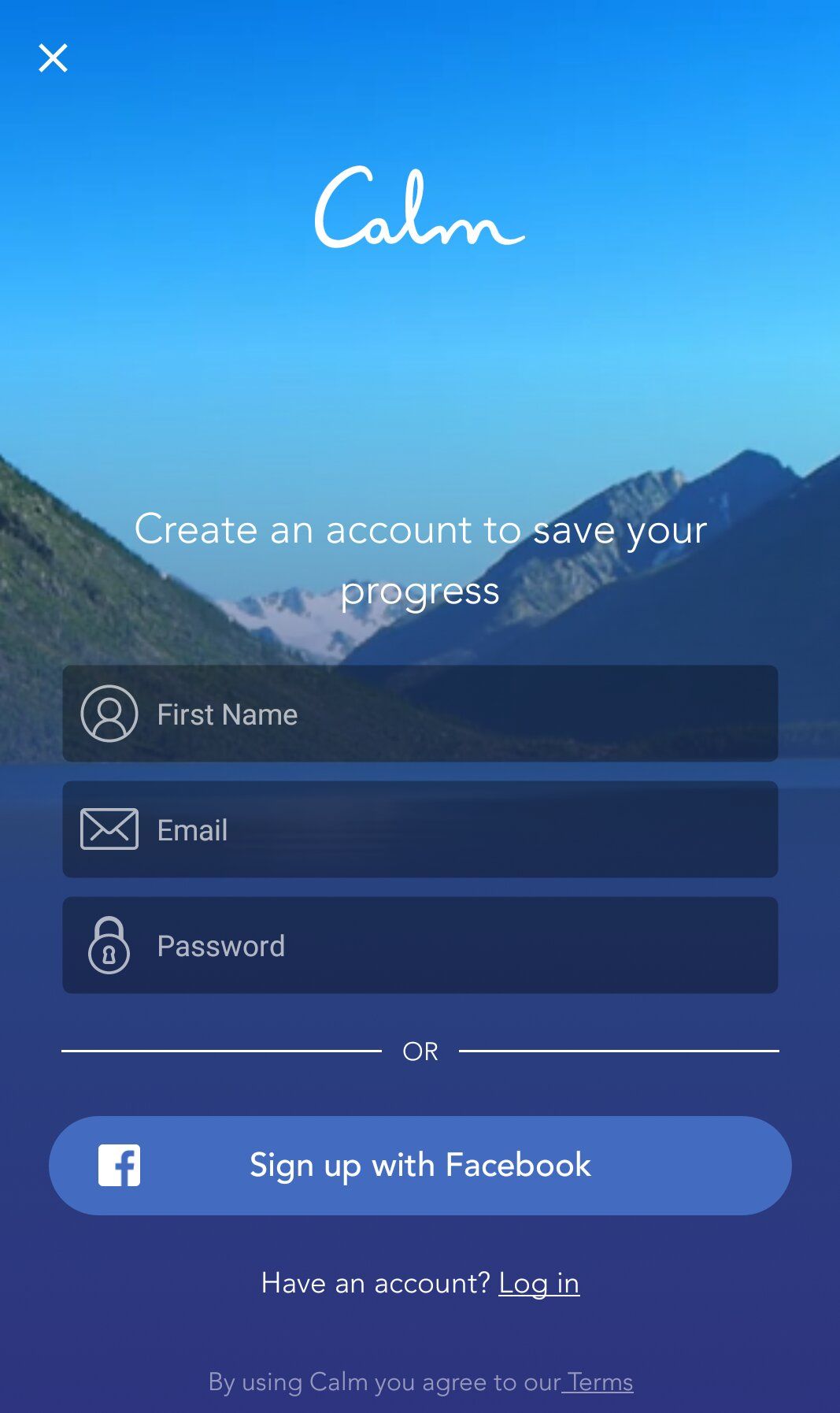
You should give clear instructions to your guided meditation practice options (shots from Calm App)
So, the main mistake to avoid is giving unclear instruction since it can worsen the user experience. If you need customers to do something, you should set out everything as clearly as possible, step-by-step, with the opportunity to go to the previous step or back to instructions.
🧘 Headspace
Headspace is the 2nd most downloaded app (according to Statista rating) for Meditation & Mindfulness, Sleep Improvement, and Stress Relief. In general, there are more than 370 meditation sessions, with 10 of the basic courses being free.
Headspace has a series of meditations, which can include from 10 to 30 sessions, as well as singular sessions. Additionally, users can choose the duration of a session. For example, sessions in the “Basics” courses last for 3, 5, and 10 minutes. Moreover, mediations are divided into 3 levels.
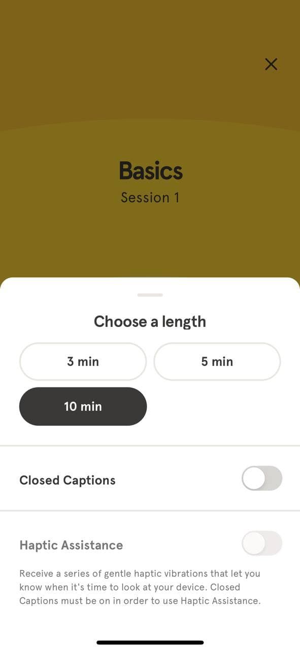
Headspace meditation & mindfulness app has a lot of meditation practice options with courses on different topics and download opportunity (shots from Headspace App)
The app is also based on the freemium model - $69.99 per year or 12.99 per month for the premium version. Before having to pay, users get to experience the full version at no cost for 14 days. As Calm does, Headspace puts a lock on sessions that are accessible in the premium version only.
The app has “Daily Mindful Moments” — these are certain motivational relevant quotes or messages that give one food for thought as well as encourage them to meditate. They have different varieties of exercise within the sessions, a lot of educational materials, and music stations.
They also involve celebrities in their marketing and the app. For instance, John Legend was assigned the Chief Music Officer position in Headspace. Also, there are educational videos with him and other celebrities.
They have a lot of music tracks Moreover, it provides users with statistics like completed sessions & check-ins.
Even though Calm and Headspace have a lot in common in terms of tips and tricks they can teach us, there are certain aspects that make Headspace a unique case.
Headspace: Tips & Tricks 🃏
# 1: Make Free Content Easily Accessible to your Audience
When considering how to make a wellness app — or exploring fitness app development services — note that many meditation apps have a premium trial and some free sessions accessible all the time without a subscription. However, when you build your own fitness app, it’s most common to provide free content directly in the app, ensuring users download it first.
Headspace chose a more user-centric approach and allows listening to all free meditations right on their website. So, there’s no need to put extra effort and download the app.
It’s a really good marketing strategy — to give potential users a taste of what they might get for free with as little effort needed as possible.
Even if you don’t have a website, it’s not that important. You can create a simple landing page for this purpose or figure out your own way. The crucial thing here is to make free content easily accessible to your audience.
# 2: Uniqueness
Another thing you can do to provide a better user experience as well as stand out is adding some unique features to your app. Surely, unique doesn’t mean something that wasn’t on the market before. It’s rather something that’s not popularized but has a great potential.
In the Headspace app, there’s a thing called the buddies feature. Each premium subscriber can invite other people to form a group in the app and do various activities together:
- See other members’ practices.
- Access the progress.
- Motivate & encourage each other.
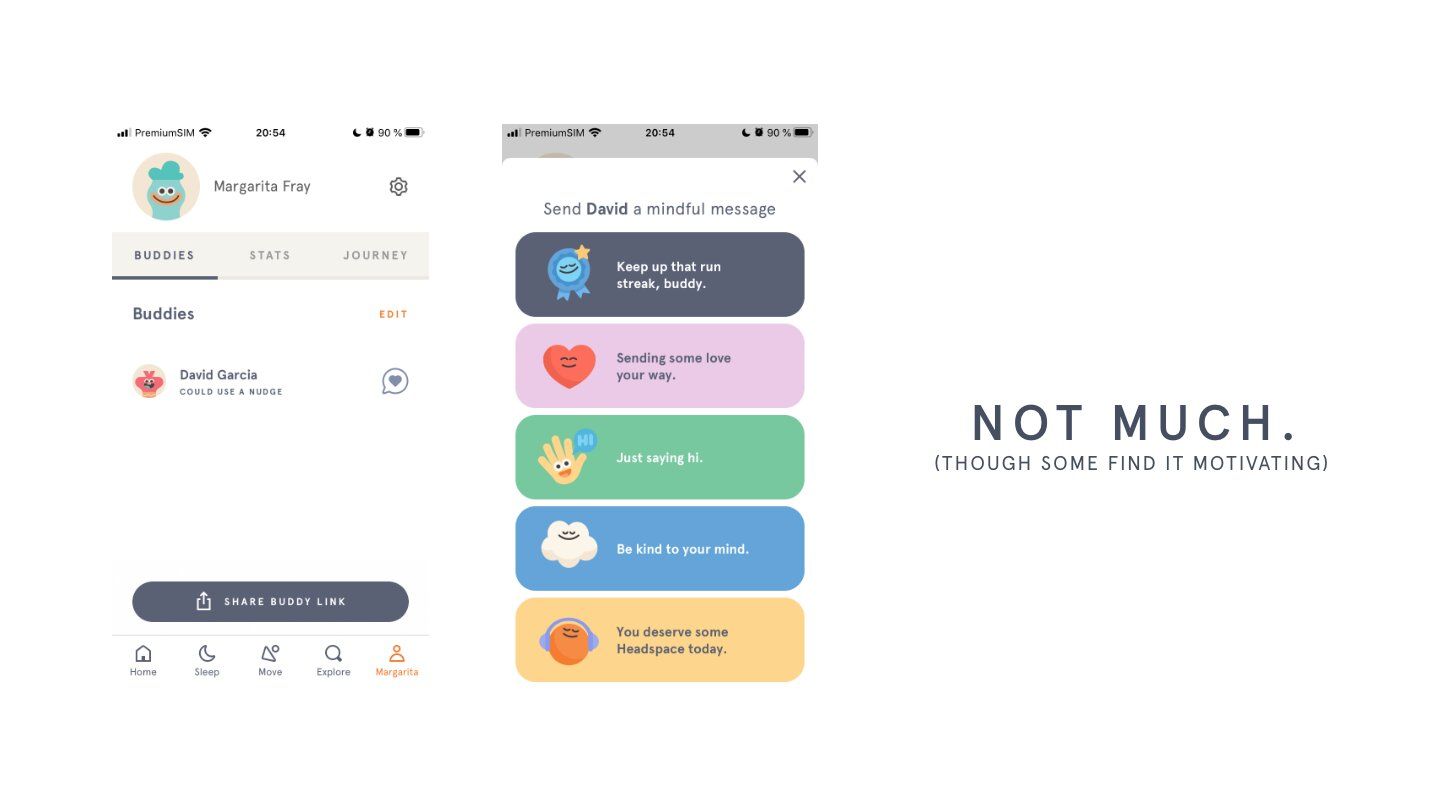
Headspace mindfulness and meditation app has a in-app purchases that give access to more sessions to meditate (shots from Medium)
Furthermore, Headspace likes to call themselves “gym membership for the mind”, which greatly represents a broad image of their brand.
This allows Headspace to stand out. Firstly, it complies with a broad image of their brand & is consistent with it. Secondly, the chances that random people would remember “that one” gym membership for the mind is higher, compared to products that don’t have any highlights.
Thus, it might be a great idea to make your brand more special and unique so people would see it as **you **want at first.
“Brand is just a perception, and perception will match reality over time.” — Elon Musk, Co-Founder & CEO, SpaceX
# 3: Define Benefits
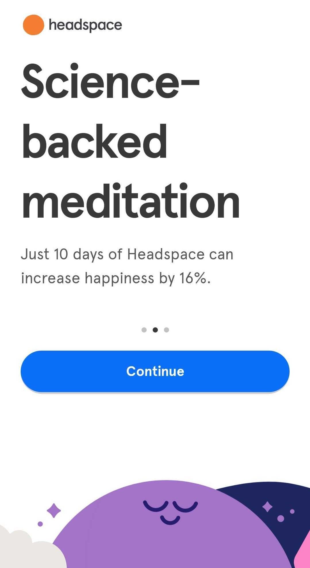
People are less likely to be interested in your app if you give them abstract benefits from using it. For example, “You can reduce stress” sounds less convincing than “2 weeks with us can help you reduce stress by 24%”.
And that’s exactly what Headspace did. During the sign-up they let you know that “10 days with Headspace can increase happiness by 16%”.
Meditations in Headspace’s premium access subscription can are stored in a library (shots from Calm App)
So, the lesson here is that you should give the exact benefits that the audience might get from using your app. It can make you look trustworthy and more compelling.
Aspects to Improve 📈
In this section, we’re going to review how Headspace could use certain things to open up their maximum potential.
# 1: Use All Opportunities
Headspace was founded by Buddhist monk Andy Puddicombe in 2010. Meditation app founded by a monk? Sounds like a pretty good marketing tool or slogan.
However, Headspace didn’t really draw attention to this fact or use it to promote their app. The potential of having the monk as a founder of a meditation app is unlimited.
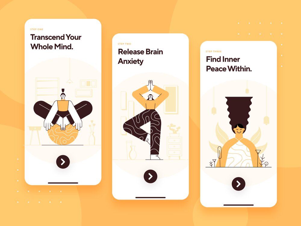
For a meditations app, it’s important to have a wide range of meditations in a library (image by Samuel Oktavianus)
So, if you have a certain specialty about your app, team, development process (maybe, you have implemented best meditation practices from Kathmandu monasteries), or whatever, we’d recommend using it to stand out.
# 2: Use Habitual Behavioral Patterns
Even though uniqueness is a great thing in most cases, there are certain aspects where such a trait can be seen as rather strange or unusual.
If we take a look at Headspace’s meditation screens, there are things that don't perfectly match the habitual UX design — the “Play” button doesn’t disappear when tapping on other parts of the screen or after a certain time.
Most users are accustomed to a pattern where the button disappears, so if it doesn’t, it can cause confusion or even irritation.
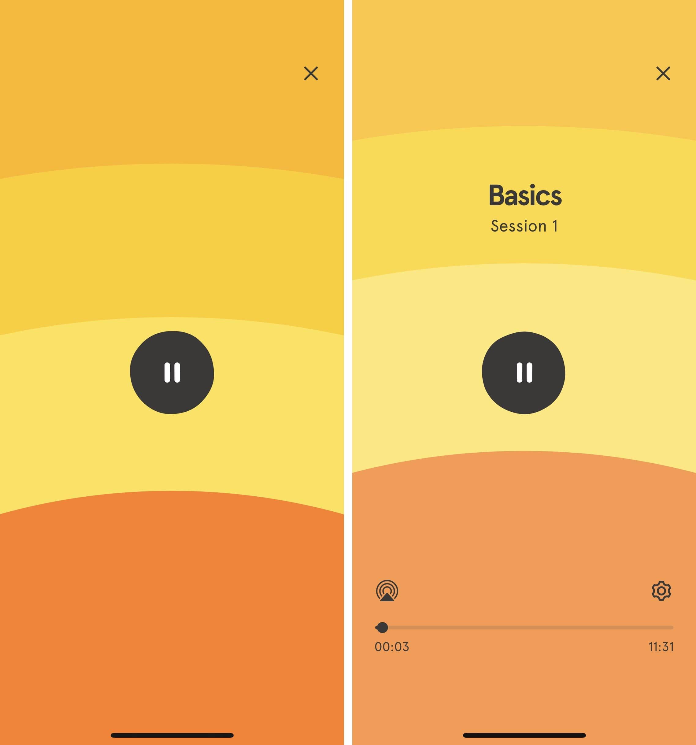
It’s essential for a meditations app to use habitual UX patterns (shots from Calm App)
Thus, we’d recommend using UX patterns that people are used to. Surely, it doesn't mean that if you use something unusual, people don't like it. It’s just that you should decide whether you want to risk it and if using a new pattern is necessary for your use case.
# 3: Offer Different Opportunities
At the very beginning of your journey, Headspace will ask you about the goals you want to achieve by meditating. For example, stress relief, focus, etc. However, it’s not possible to choose several goals.
So, if a user wants to work on stress relief and sleep improvement, they can mark it in the app. Besides, users aren’t given any recommendations based on their personal goals.
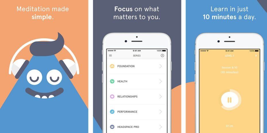
Meditations app should have a wide range of meditations library (Business Insider)
Additionally, there are no instructions on how to update your preferences, so if they change, users won’t be able to find where to mark it — at least, not intuitively.
Therefore, it’s really important to cover as many user needs as possible. And not only cover but use it to provide a more personalized experience, make targeted offers, and address the audience’s needs better.
⏱️ Insight Timer
Insight Timer is a meditation & mindfulness app, which many people like for their user-centric view on the product. The app offers more than 90,000 meditation sessions to its users, provided by 8,000 teachers from all over the world — and all of that for free.
Their meditations, classes, and talks include sessions on a variety of topics: Buddhism, Chakras, anxiety, grief, addiction, masculinity, femininity, tantra, attracting love, Ayurveda, and many others.

A meditation app like Insight Timer can have functionality to track habits (image by Andrew McKay)
Those who want to support Insight Timer with a premium subscription can do it for an affordable price - $59.99 per year or $9.99 per month. Additionally, users can donate to teachers/narrators.
Those who want to try out the premium meditation options first are offered a 30-day trial.
Their features & content include:
- Meditation Timer with different sounds (gong, wood block, various bells like kangse, dengze, sakya, etc.).
- Music.
- Yoga sessions.
- Group meditations.
- Sections for parents, teens, and beginners.
- Gamification: streaks, minutes spent meditating, milestones.
Now let’s take a look at tips & tricks we can learn from this app.
Insight Timer: Tips & Tricks 🃏
# 1: Don’t Force Users to Sign Up
When opening an app for the first time, many users expect the sign-up screen to pop up. However, Insight Timer doesn't have such a UX pattern. Instead, users are asked what brings them here today and then transferred to the main screen with meditations directly.
Surely, it can be done anytime a user wants, yet, it’s not a necessity and all content is accessible without an account.
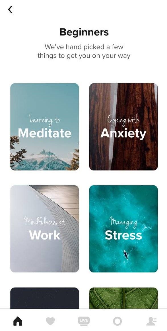
A meditation solution like Insight Timer can have multiple features to track habits to reach goals (shots from Insight Timer)
This is another example of how you can make it easier for users to access your content. While Headspace places it on their website, Insight Timer also provides a burden-free user experience.
The highlight here is that it shouldn’t be difficult and multi-staged to join your community — the easier, the better.
# 2: Introduce Live Streaming
The app has a live streaming feature. And streams are managed by teachers for the most part. The most interesting thing is that they’re not dedicated to meditations only.
Streaming can be about anything:
- A person showing their subscribers peaceful nature.
- Playing musical instruments.
- Guided live meditations.
- Yoga exercise.
- Self-massage for stress relief, muscle tensions & many others.
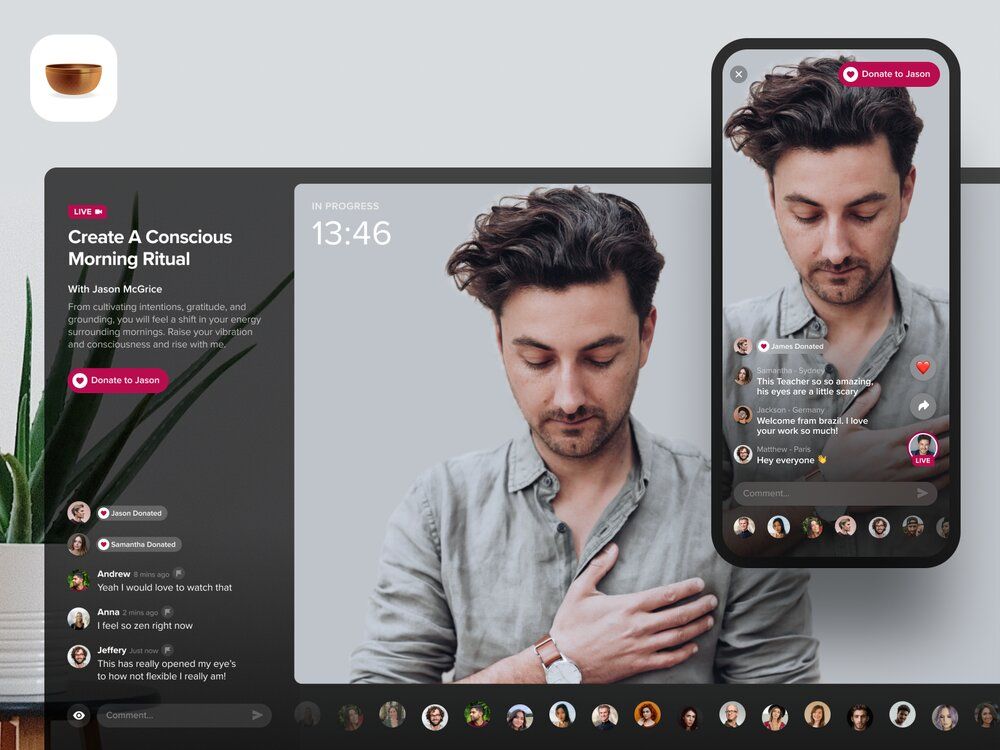
Headspace-like app for meditation with in-app purchases and affordable subscription price (image by Andrew McKay)
So, the recommendation here would be pretty straightforward — think about enabling live streaming in your app. Motivation and the feeling of unity play a significant role, and for many people, being able to join someone at meditation in real-time would give more than enough.
# 3: Build a Community
Insight Timer has a bunch of features that many other meditation apps don’t. Users can:
- Like meditations and other content to save it to “Bookmarks”.
- Follow teachers & narrators, donate to them.
- Group meditations & challenges like “10 days eco-challenge”.
- Add other users as friends.
- Chat.
Additionally, when a user finishes watching the content, the app will say how many people were doing the same thing with them simultaneously.

Headspace-like app for meditation with in-app purchases and affordable subscription price (shots from Insight Timer)
All of that allowed them to create a strong community around the app. People chat, talk, share experiences, support each other, learn new things — they just communicate and educate themselves together.
Such a strong bond works beneficial for both Insight Timer and users. The app benefits from it as a marketing tool and additional engagement feature. Users, from their perspective, don’t feel alone on their journey and find additional motivation in other members of the app.
So, building up a community around the app can be quite a bright idea. There are several ways how you can do it:
- Create social media groups and forums.
- Allow such features as befriending, messaging, etc.
- Organize classes or lectures with an opportunity for users to actually do something (like share thoughts, chat, take questionnaires, exercise. etc/) once in a while.
- Allow users to invite friends, share their experience on their accounts, track each others’ progress & so on.
Aspects to Improve 📈
Here, we’ll cover a couple of aspects where Insight Timer could improve their app & digital user experience a bit.
# 1: Inconsistency
They provide 90,000 meditation sessions & other features for free. That sounds almost like a robbery. We all can agree that it’s really generous and kind of them.
Yet, there’s basic functionality that’s only accessible with a premium version. For example, free version users can’t rewind, fast forward, or pick up video or audio content where they left.
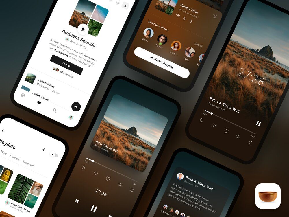
For an app for meditation, consistency is as important as affordable subscription price and wide meditation range (image by Andrew McKay)
So, on the one side, we have cost-free diverse content, on the other — having no option to rewind a meditation without a premium.
Our advice here would be to find a proper balance between free & paid content & features (if you have both).
# 2: Server Choice
Insight Timer users send complaints on the fact that sometimes live streams or sessions aren’t accessible. And it’s most likely because of the inconsistency of the amount of content and the server configuration.
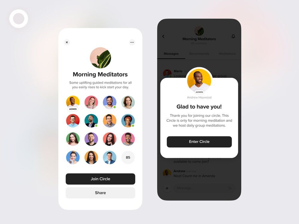
Headspace-like app for meditation with should pay attention to finding a suitable server for an affordable subscription price to store meditation content (image by Andrew McKay)
So, the problem here can be that the server capacity can’t properly handle the amount of content that’s based there. Because of that, lagging, glitching, and other sorts of technical issues can occur.
Or their app can be based on a server that hosts several digital products. The problem with such servers is that when one app crashes, it can cause breakdowns in other products.
We’d recommend taking some time to properly figure out what server suits your use case the best: define how much storage you’ll need, the type of the server, and so on.
The right server choice can save you a lot of money and ensure a smooth user experience.
💡 Best Meditation Apps: Takeaways
To sum up, we’d like to point out that each case is unique. The fact that it worked for one case in a certain way doesn’t mean that it’ll be the same for you.
However, researching other cases can teach you a lot, prevent mistakes, thus, reduce costs and save you time.
Let’s briefly recall what lessons we can take out from these top meditation apps cases:
- A user-oriented approach will likely be paid off.
- Customization is important to provide a great user experience.
- Gamification features can boost motivation & increase engagement.
- You should clearly set out everything you need your users to do and what they’ll get for it.
- Even though you should try to be unique, stand out, and bring something new to the market, there are certain aspects where habitual patterns might do a better job.
- Think about making free content easily accessible for potential & current users.
- Diversify & fresh up the content on a regular basis.
- Building up a community around your app will do much good to your business.
- Be consistent with your brand, all devices, and choose the suitable server.
If you need any help with the development, have questions left or want to share your thoughts on this article, feel free to reach out to us. We’ll be happy to help you!

![Stormotion client David Lesser, CEO from [object Object]](/static/93e047dadd367691c604d8ffd1f54b58/b0e74/david.png)


