How to Create a Collapsing Tab Header Using React Native
Published: November 8, 2023
7 min read


In this article, you'll learn:
1
Starting point of creating React Native collapsible tab
2
Simple static header
3
Animating the Header
4
Scroll syncing
Collapsing header and swipeable tabs are one of the most common UI elements in mobile apps. Such a pattern is widely used on profile screens on Social Media apps like Instagram or Twitter, for example.
In this article, we are going to create a screen with a collapsing header and multiple swipeable tabs below step-by-step using the extensive experience of our React Native app development company. This behavior can be achieved easily with the help of React Native Reanimated and React Navigation libraries.
Starting point of creating React Native collapsible tab
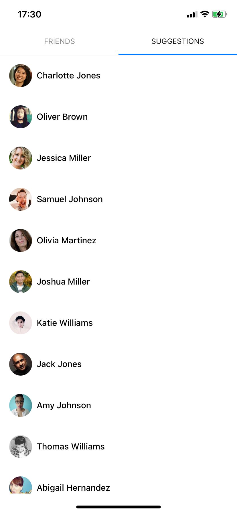
This simple tab screen will be the starting point of our journey. It’s just 2 tabs created using material top tab navigator from React Navigation. Each tab contains a FlatList with some mocked data.
Nothing special about the implementation of the ConnectionList, except for a reference forwarding. We’ll need to use this technique in the future, so let’s prepare it in advance.
Here is the simple Profile component with two tabs. It will be the canvas for our future React Native collapsible tabs.
That’s what we have after completing the first step and rendering the component above.


Simple static header
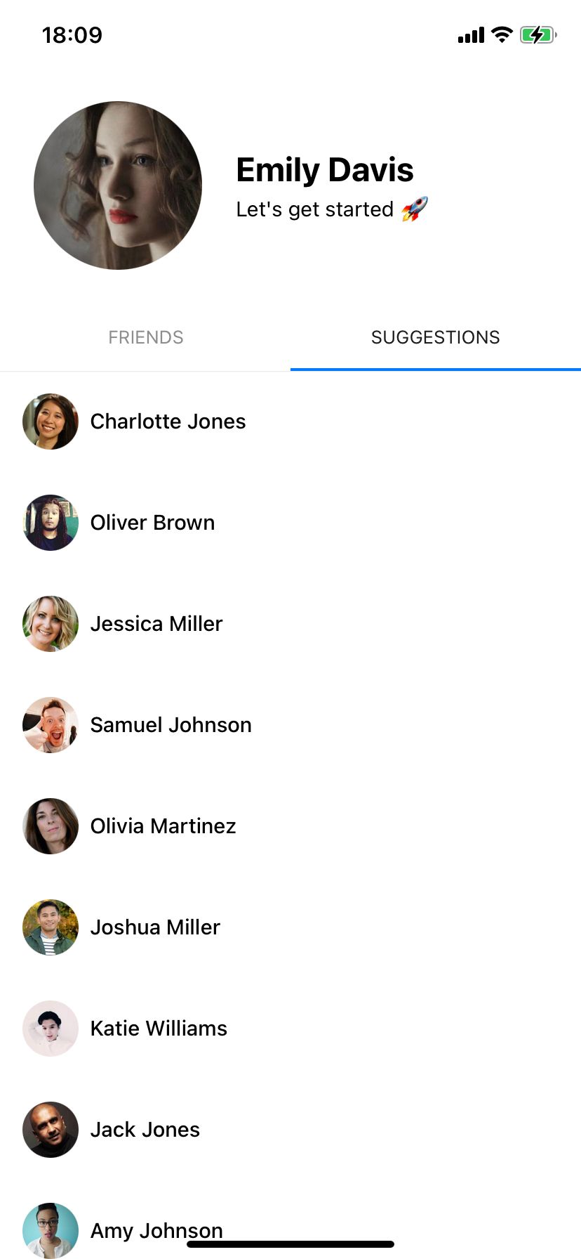
To implement collapsing behavior, we’ll need to place the header above our screen and add a corresponding offset to the list and tab components.
In order to provide a correct offset, we’ll have to know the exact height of the header. If you already know it — good for youNothing needs to be solved when we already know the height before rendering. But it’s not the case, so this is where onLayout comes in handy.
This offset should be added to the tab bar component and the content containers of our lists. React Navigation provides an easy way to customize a tab bar appearance via tabBar prop.
Additionally, let’s replace the SafeAreaView container with a plain View. It’s better to add the insets handling manually inside the content containers to avoid the list item cutting like in the first screenshot.
Okay, that will work, but what about the very first render? We still know nothing about the header’s height and onLayout callback hasn’t been called yet. To avoid the abruptness of the swipes caused by the unsuitable header height, we’ll have to be a little bit creative.
The idea is to use relative rendering instead of absolute one, but only for the first render. The components will perfectly align below one another with no additional help. And as soon as we know the header’s height, we’ll re-render it using absolute alignment. The component tree will be adjusted, but a user won’t notice a thing.

Animating the Header
After we’ve created a static header, it’s time to spice it up with some animations.
React Native Reanimated has been recently upgraded to v2, which brings a brand new imperative animation API. At Stormotion, we always try to be up to date with the new technologies and approaches, so we definitely wanted to give it a go 🚀
The point of animation here is to make more space for the main content by collapsing the header and making the tabs stick to the top as the user scrolls.
Before starting to work on animations, we’d like to provide a simple way to determine the scroll length required to collapse the header.
In this case, header height diff is exactly equal to the scroll distance we need to use.
With React Native Reanimated, animated scroll value capturing became significantly easier.
Now, we need to create some variable which will reflect the animated scroll position of the currently displayed list. Unfortunately, tab navigator doesn’t provide any way to listen to current tab changes. However, we can achieve this by a little trick with a custom tab bar.
At this stage, we can finally animate the header.


As you can see, collapsing is working, but it’s not exactly what we wanted — an excess part of the header remains displayed and cropped. Our goal here is to display only a profile name when the header is collapsed.
Looks much better!


Here is the detailed overview of the dimensions used to create the collapsing animation.


{ rel="nofollow" target="_blank" .default-md}*)](https://cdn.sanity.io/images/ordgikwe/production/6ce68645bd74e6a62a05c9e523867ed7c125bcb5-3728x2331.jpg?w=3728&h=2331&auto=format)
Collapsing tab header dimensions (image by Stormotion)
Scroll syncing
This example already looks pretty good, but it isn't completely ready yet since we wanted to have more than 1 list. In this case, we have to synchronize the header position between the two tabs. Otherwise, the header will jump while switching the tab.


The idea is to manually set a correct offset to all the lists that are not displayed to sync them with the currently displayed tab.
We’ll need to create some entity which we will use to store the information about each list reference and its current position. Let’s name it ScrollPair:
Here is where previously implemented ref forwarding comes in handy. This list of the so-called scroll pairs will help us to go through all the lists and sync the header position.
In fact, this concise hook is the key solution of the issue! In the sync function, we are iterating over the list of all scroll pairs and adjusting their scroll offset depending on the offset of the current list.
When applying the hook to the list, we’d recommend using both onMomentumScrollEnd and onScrollEndDrag callbacks to cover all possible scrolling cases.
The last but not the least. Some lists, like our “Friends” list are too short to perform long enough scroll in order to collapse the header. Therefore, we need to add a satisfying minHeight to the contentContainerStyle prop.
That’s it, the screen is ready! We hope that this step-by-step guide was helpful for you!


You can find the complete source code in our GitHub repository.
If you have any questions, feel free to reach out to us. We’ll be happy to help you out.
Was it helpful?

Read also


10 Innovative Fitness Application Ideas: Revolutionizing Personal Health and Wellness


How to Add AI to Your App: Guide With Examples


How to Develop a Wellness App: Case Study-Based Guide
Our clients say

![Stormotion client Max Scheidlock, Product Manager from [object Object]](/static/33294af91c38256bcd5a780ddc41861a/1b3aa/max.webp)
They understand what it takes to be a great service provider, prioritizing our success over money. I think their approach to addressing ambiguity is their biggest strength. It definitely sets them apart from other remote developers.
Max Scheidlock, Product Manager
HUMANOO